Reckoning with the U.S. Data Center Boom: A Geographic Analysis
As Big Tech pushes AI adoption, it’s racing to build the physical infrastructure that enables the unprecedented computing power needed to support it. This is a geographic exploration of the socioeconomic factors — and costs — of the U.S. data center boom.
01 Challenge: Visually capture the potential relationships between data centers and socioeconomic factors.
In the past year, data centers have become one of the latest hot-button topics entering the mainstream media sphere. They’re a top priority for Big Tech companies looking to support existing investments in artificial intelligence (AI), but they face pressure from advocacy groups, residents, and a growing number of politicians as they cite environmental impact issues and a growing concern over a lack of AI regulation. Data around data center locations in relation to energy usage and price is precarious, and I’m working to visually capture the potential relationships between them. This project is partly inspired by Business Insider’s extensive efforts to map US data centers, and leverages their public data center location database.
02 Solution: A geographic analysis of key socioeconomic factors
The relationship between data centers and energy in the US is complex, so I set out to capture various aspects of the relationship primarily using ArcGIS. The culmination of my research is captured in the below academic poster, which I presented at Pratt Institute’s InfoShow 2026.
03 Process: Data exploration & analysis
Data exploration & analysis
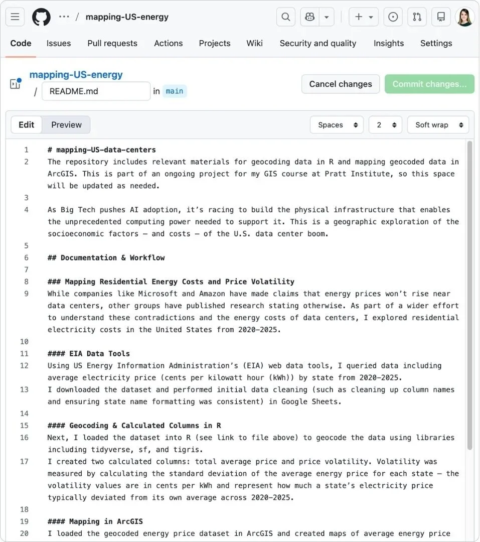
Primary sources of data include residential energy prices and industry energy usage from the US Energy Information Administration, as well as data center locations mapped by US state and county created by Business Insider. Exploratory analysis has included efforts to geocode the datasets in order to map them with the appropriate libraries and processes in R and Python.
Geographic analysis: U.S. energy prices
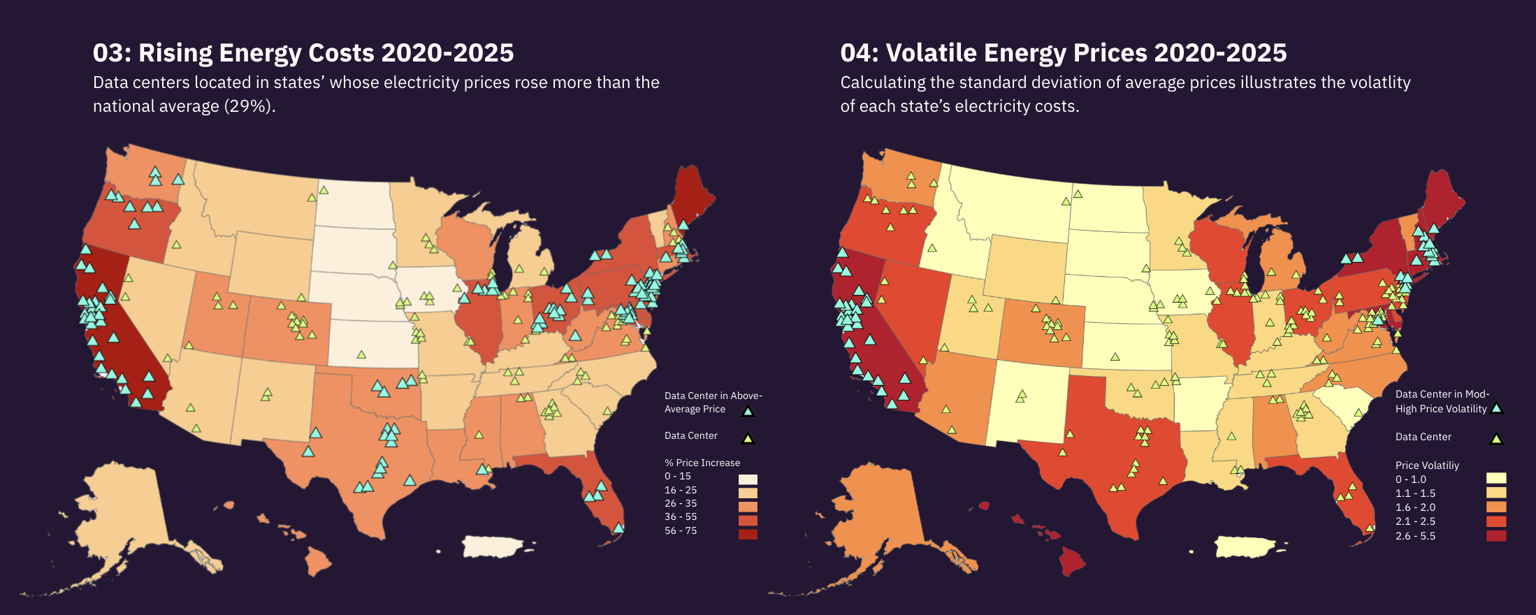
While companies like Microsoft and Amazon have made claims that energy prices won’t rise near data centers, other groups have published research stating otherwise. Who’s right, Big Tech, or these other research and advocacy groups?
Accessing APIs: Using EIA’s web data tools, I queried data including average electricity price (cents per kilowatt hour (kWh)) by state from 2020-2025. I downloaded the dataset and performed initial data cleaning (such as cleaning up column names and ensuring state name formatting was consistent) in Google Sheets.
Geocoding data & determining price volatility: Next, I loaded the dataset into R to geocode it using libraries including tidyverse, sf, and tigris. Because the dataset gave me average price by state per year, I created a computed column that calculated price volatility, that is, the standard deviation of the average energy price for each state — the volatility values are in cents per kWh and represent how much a state’s electricity price typically deviated from its own average across 2020-2025. I decided to visualize this to add a layer of depth to simple average price data, offering further context around rising prices.
Mapping in ArcGIS: With my newly geocoded dataset, I created individual maps of average electricity price by state for each year 2020-2025. Then, I created a separate map for electricity price volatility. The final visual consists of price volatility as the main map, and average price maps for each year as an inset.
03 Process: Data exploration & analysis, cont.
Geographic analysis: data center locations & the Social Vulnerability Index (SVI)
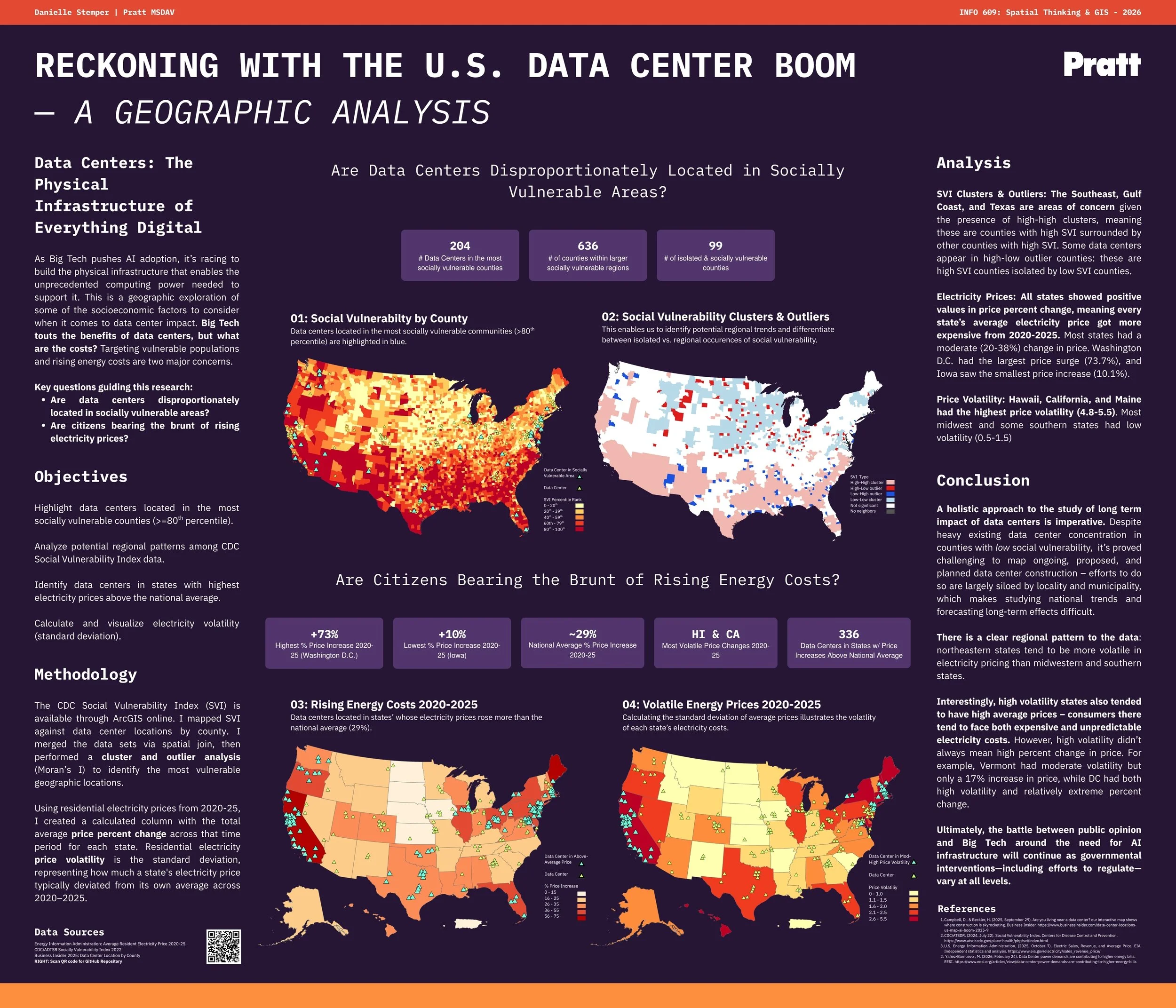
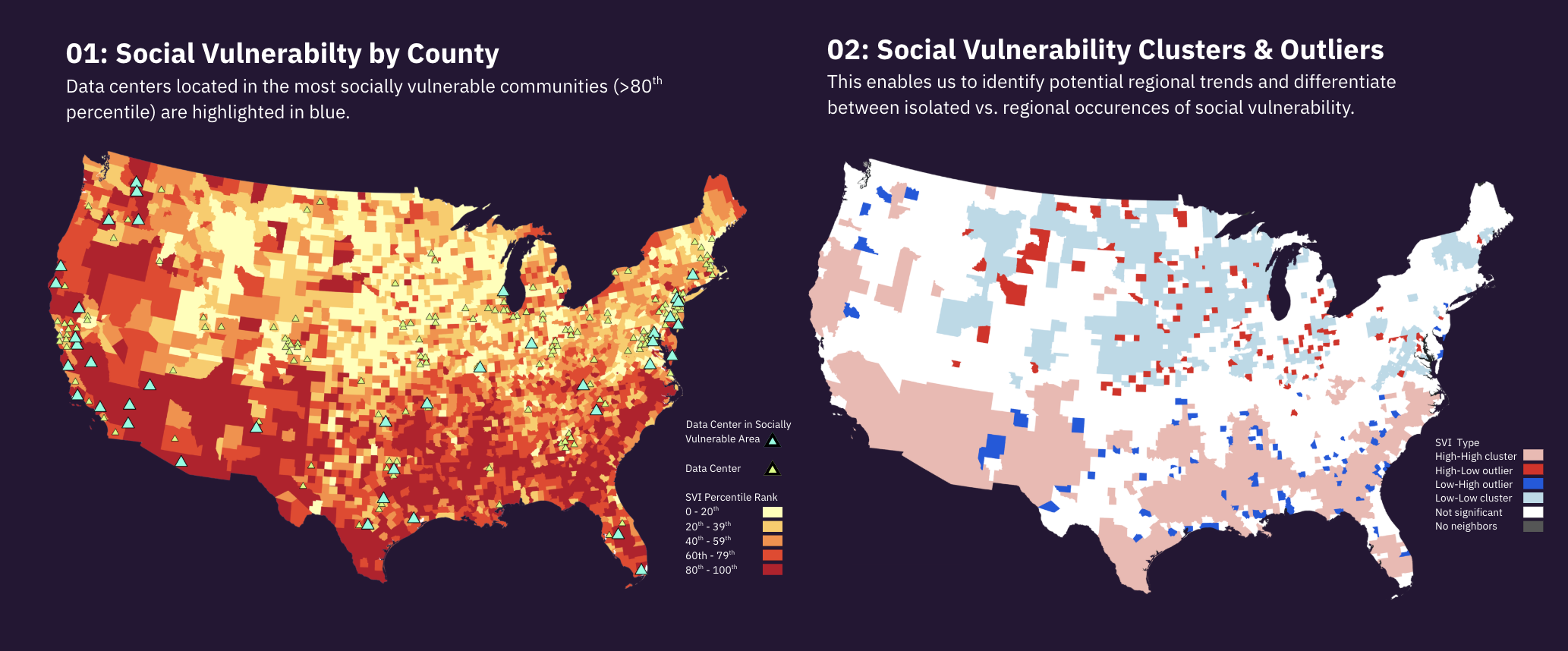
The Center for Disease Control and Prevention and Agency for Toxic Substances and Disease Registry Social Vulnerability Index (CDC/ATSDR SVI or SVI) is a place-based index and database designed to identify and quantify communities experiencing social vulnerability. According to the CDC, the SVI can help public health officials and local planners better prepare for and respond to emergencies with the goal of minimizing human suffering, economic loss, and health inequities. With the potentially harmful impact of data centers on humans and the environment, I explored the following research question: are data centers disproportionately located in socially vulnerable areas?
Accessing CDC/ATSDR SVI data: the CDC’s Social Vulnerability Index is accessible through ArcGIS online, or available for download at their website.
ArcGIS analysis tools: after loading both data center locations and SVI data, I performed a spatial join so that I would be able to filter out data centers that are located in the most vulnerable counties (see below map, left). Next, I conducted a cluster and outlier analysis (Anselin Local Moran’s I) in order to identify potential patterns among the SVI data (see below map, right).
04 Findings & Reflection
Energy Prices
Average prices increased year-over-year: notably, all states in the data showed positive values, meaning every state’s electricity got more expensive from 2020-2025. Washington DC (73.7%) had the largest price surge as prices nearly doubled in 6 years. Iowa (10.1%) saw the smallest price increase. The national average increase was ~29%.
Price volatility varied by region: Hawaii (5.5) and California (5.0) had the most volatile prices. Iowa (0.46) and North Dakota (0.49) had the most stable prices. Northeastern states tend to be more volatile in electricity pricing that midwestern and southern states. Interestingly, high volatility states like California, Hawaii, and Maine also tended to have the highest average prices — consumers there face both relatively more expensive and unpredictable energy costs.
SVI Cluster and Outlier Analysis
Areas of concern: Southeast, Gulf Coast, Texas: there are large high-high clusters — counties with high social vulnerability that have neighboring counties with high social vulnerability — with some data centers present.
Isolated areas of vulnerability: some data centers appear in high-low outlier counties — a county with high social vulnerability whose neighbors do not have high social vulnerability — scattered across the U.S.
Low vulnerability areas: heavy data center concentration in low-low cluster counties. These counties have low social vulnerability, and so do their neighbors.
Reflection
Despite heavy existing data center concentration in counties with low social vulnerability, the long-term impacts of data centers are still being studied. It’s also proved challenging to map ongoing, proposed, and planned data center construction — efforts to do so are largely siloed by locality and municipality, which makes studying national trends difficult. However, as more data are collected and further studies on the impact of data centers are conducted, we can better understand what makes a location attractive for data center construction and how local governments can develop effective regulation to mitigate harm.
Library imports, summary of function sections, and documentation
INFO 609 Intro to GIS
Professor John Lauermann
Pratt Institute School of Information | Spring 2026