Creating an Engaging & Intuitive Experience for the Inspired Minds Art Center Website


The Inspired Minds Art Center
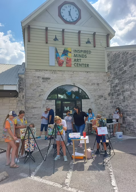
Located in Buda, Texas, the Inspired Minds Art Center is a creative hub that provides resources and opportunities for artists, performers, and enthusiasts of all ages. This project through Pratt Institute and the Center for Digital Experiences at Pratt uses moderated user testing to uncover usability issues on the Inspired Minds website, Inspiredminds.art, to provide potential solutions.
The team
Danielle Stemper (me)
Kshitija Tammireddi
Vasilios Nikolopoulos
Xin Yu Jiang
The Challenge
Our client had limited time and resources to dedicate toward identifying and addressing usability issues with Inspired Minds’ website. With this in mind, we were conscious about not wanting to add an overwhelming amount of work for them to do when it came to our recommendations — rather, we aimed to create a digestible and manageable guide with potential solutions that could be implemented in the short-term while also setting the stage for any longer-term efforts.
The Goal
Create a client-friendly guide to addressing key usability issues with Inspiredminds.art.
The Process: Designing a Moderated Remote User Test
We conducted eight moderated remote user tests to identify usability issues on the Inspired Minds Art Center website, Inspiredminds.art.
Kicking off client relationships
It was essential to establish a relationship with the client and hear from them, in their own words, about any feedback or insight around specific website issues experienced internally or by customers.
We learned that time and resources are a constraint, so our recommendations need to be direct and manageable without complicating things further.
Building a moderated remote user test
With our goal in mind and using best practices for writing usability tasks, our tasks focused on evaluating user flows throughout general navigation, as well as more specific navigation of things like classes and events.
We utilized a “think-aloud” method for our participants so they could speak openly about the tasks as they completed them. Screen recordings were captured using Zoom and notes were taken during the sessions.
Recruiting Inspired Minds’ target users
Finding a sample representative of our user profile was a priority – we wanted participants’ experiences to be realistic and reflective of tasks they perform in their everyday lives.
User profile: Creative women, active parents ages 25-50
We leveraged Private Panels and personal networks to identify and recruit participants within the target user profile.
Ultimately, all participants fit our participant profile and had an interest in and/or experience with art classes and workshops such as those offered by Inspired Minds.

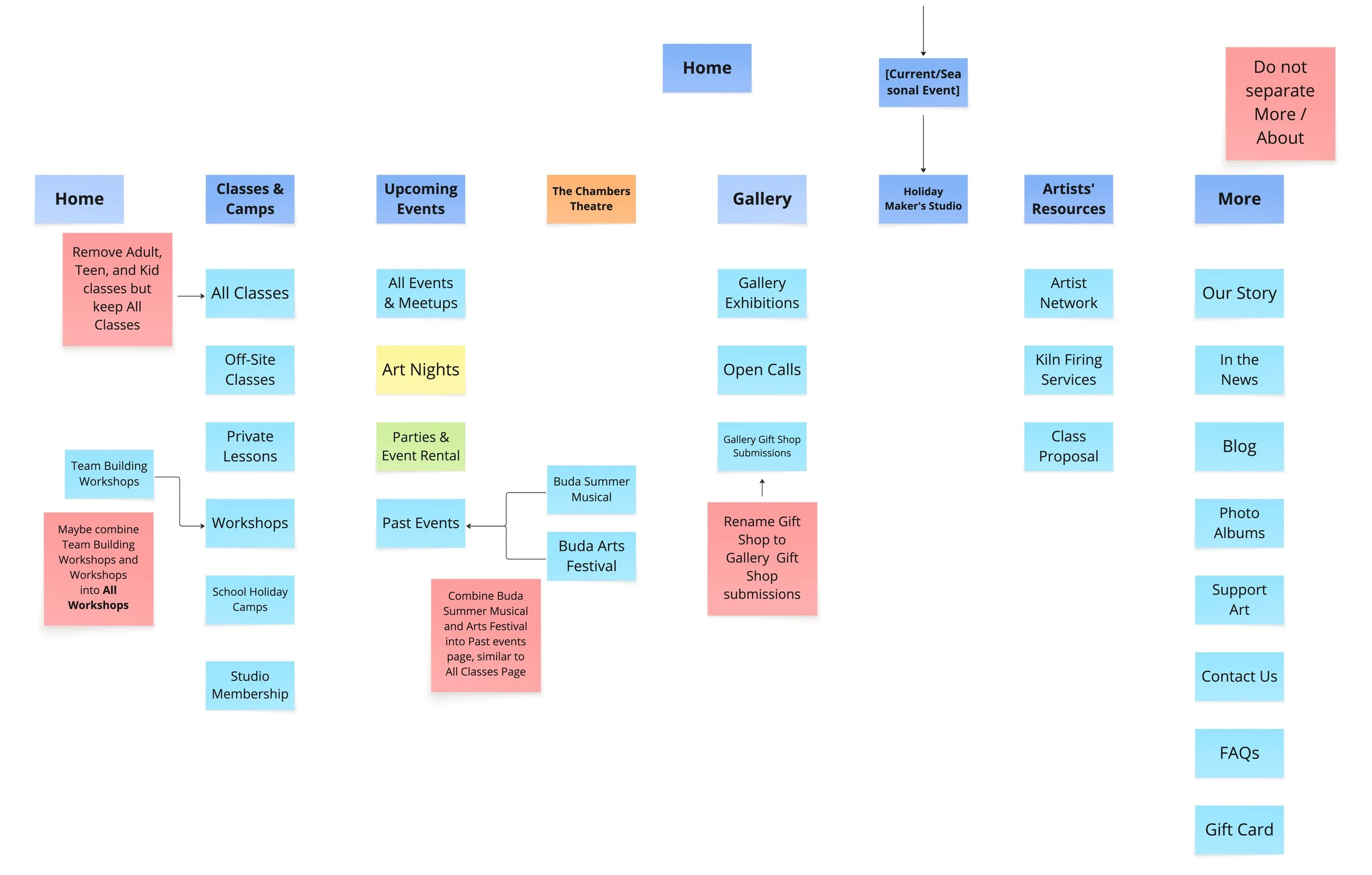
Left: digital post-it activity synthesizing notes, observations and insights from moderated remote user tests; above: we created a site map of Inspiredminds.art to solidify our understanding of site structure and navigation.
The Results: Great Content, Room for Improvement in Navigation
Enhancing First Impressions
On the homepage, users reported visual clutter that distracted from the mission of the site — we proposed adjustments to the site’s header content, which involved relocating certain items to the footer to reduce that visual clutter.
Cleaning up Navigation
There were repetitive navigation menu items that were confusing to users as they explore the site, so we created a proposed sitemap demonstrating potential options for consolidating repetitive content.
Improving Accessibility
Based on web accessibility standards, we proposed color palette recommendations to enhance color contrast accessibility.
Recommendation 1:
Reduce visual clutter and improve clarity by moving non-essential elements currently in the header to the footer.

BEFORE: Default landing page displaying overwhelming information in header. Carousel image sizes are not uniform, adding to visual overwhelm.
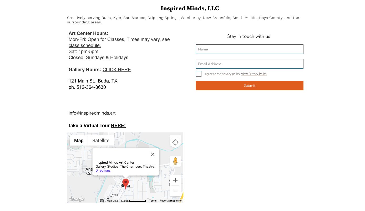
BEFORE: Position of “Hours”, “Stay in touch with us” and “Take a Virtual Tour Here” felt unintuitive in the footer.
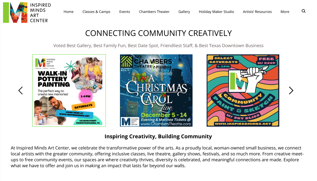
AFTER: Centered alignment of content and a balanced hero structure. Navigation bar and elements in the header sitting on a consistent baseline. Carousel images are uniform in size.
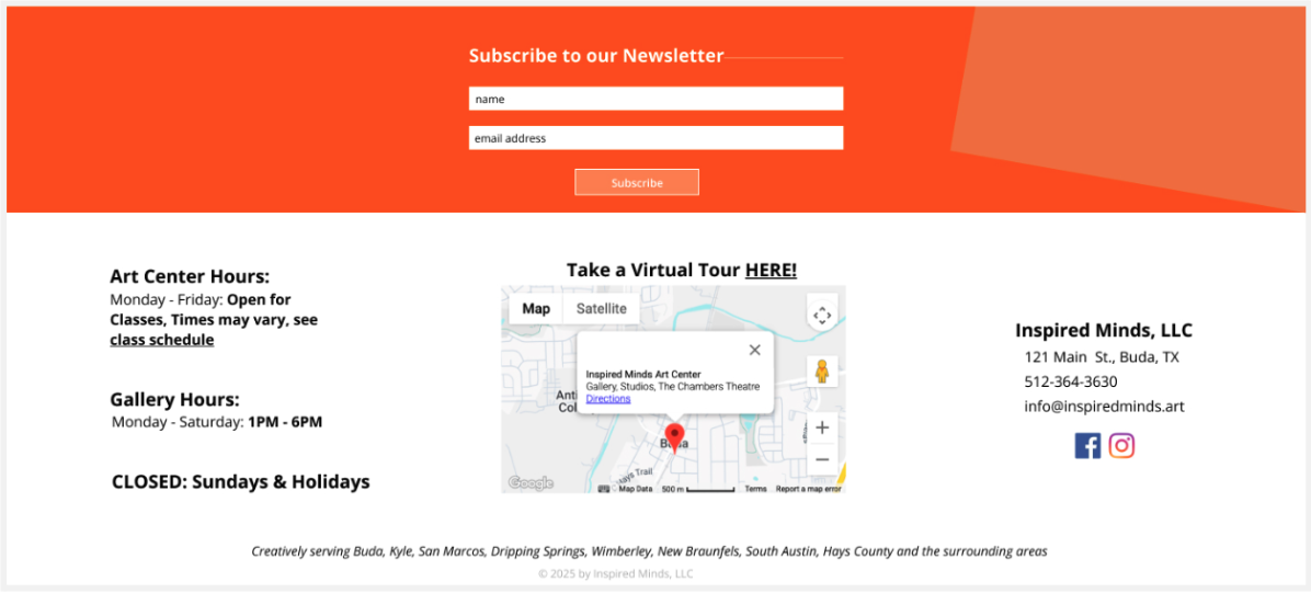
AFTER: Re-arranged information in a more intuitive structure and better use of negative space to improve scanability and visual clarity.
Recommendation 2:
Remove duplicate items from drop-down menus and reorganize the navigating structure for a more intuitive experience.
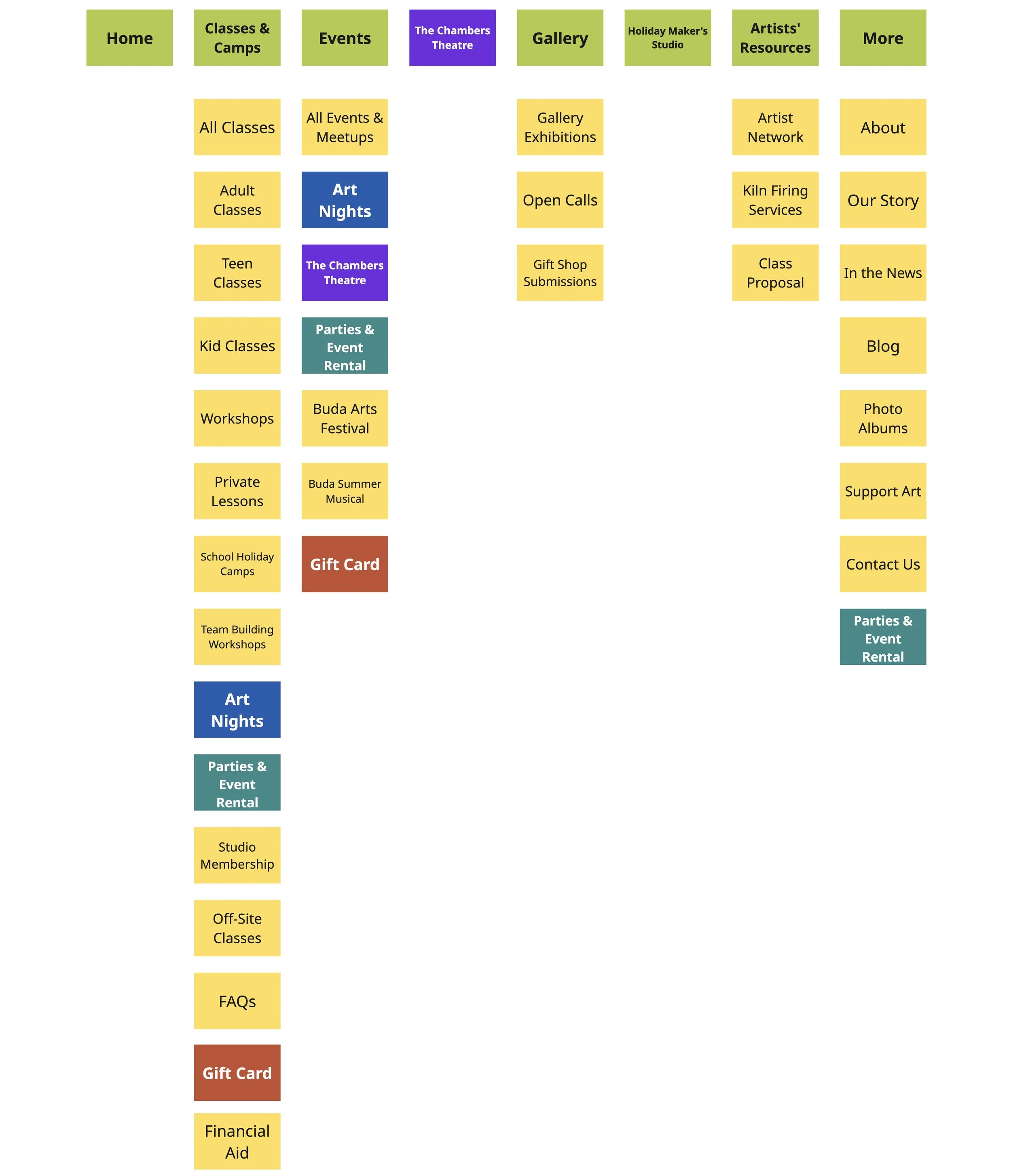
BEFORE: The initial sitemap and navigation as of the start of the project. Duplicate items have been marked in different colors.
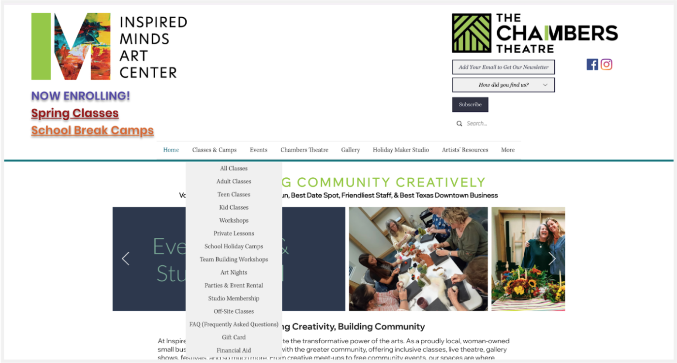
BEFORE: Current dropdown menu listing many different subcategories, some repetitive and found under other navigation items.
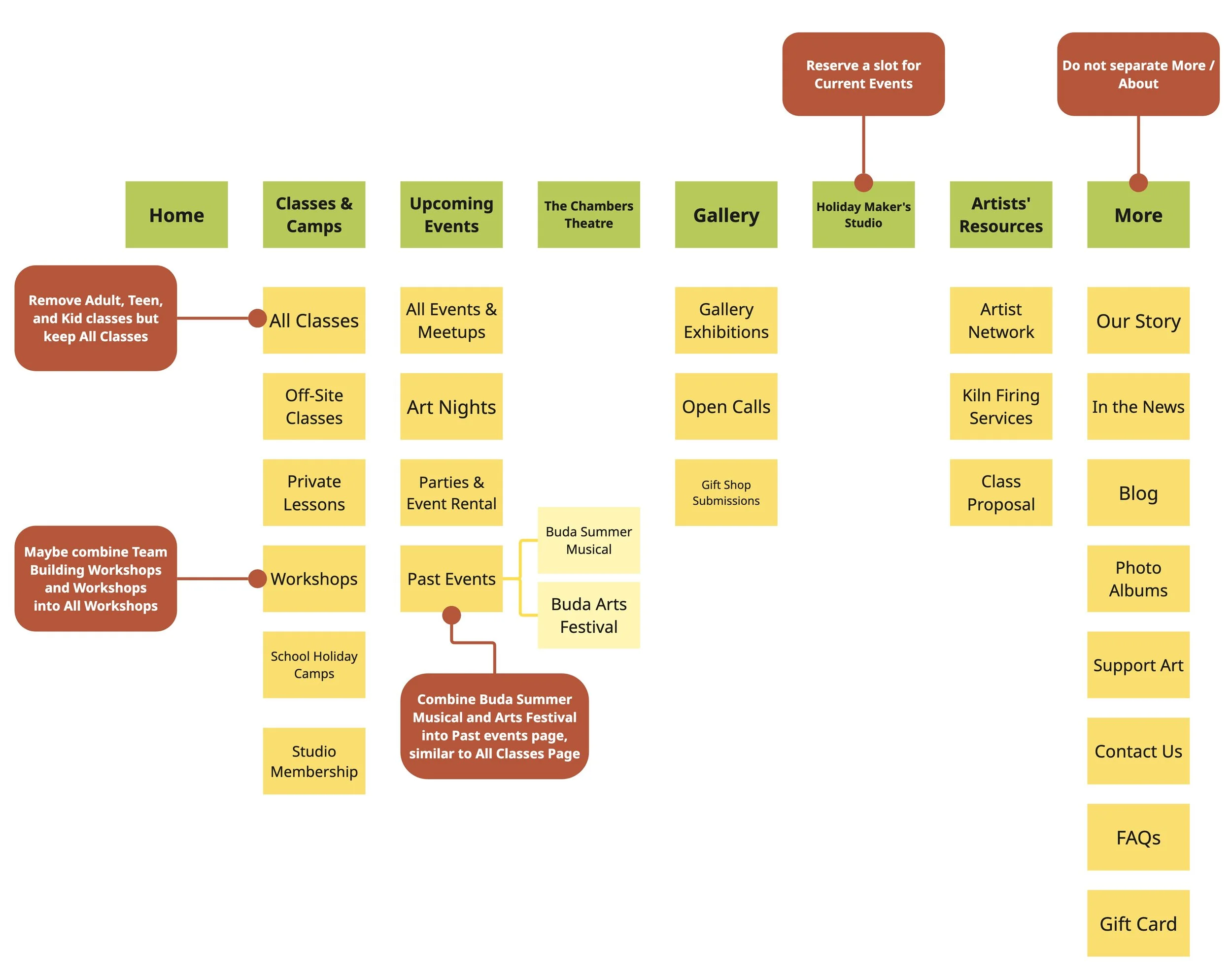
AFTER: Our proposed sitemap with consolidated options and no duplicated items.

AFTER: Updated dropdown menu with limited sub-categories.
Recommendation 3:
Increase font weight for key text elements and adjust the grey shades used on event cards to more visually accessible shades.
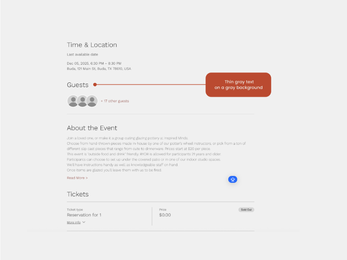
BEFORE: Low-contrast thin gray text on a gray background made event descriptions hard to read.
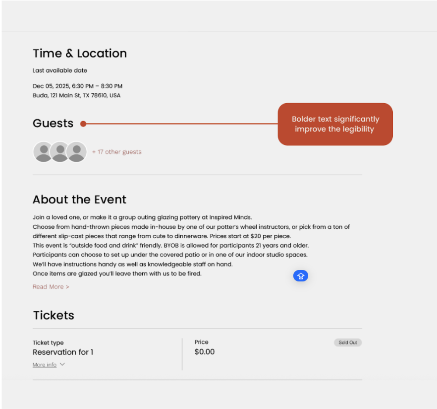
AFTER: Higher contrast and bolder text significantly improve the readability of event descriptions.
“The team ncovered tangible recommendations in a useful guide for redesign”
— Client Quote
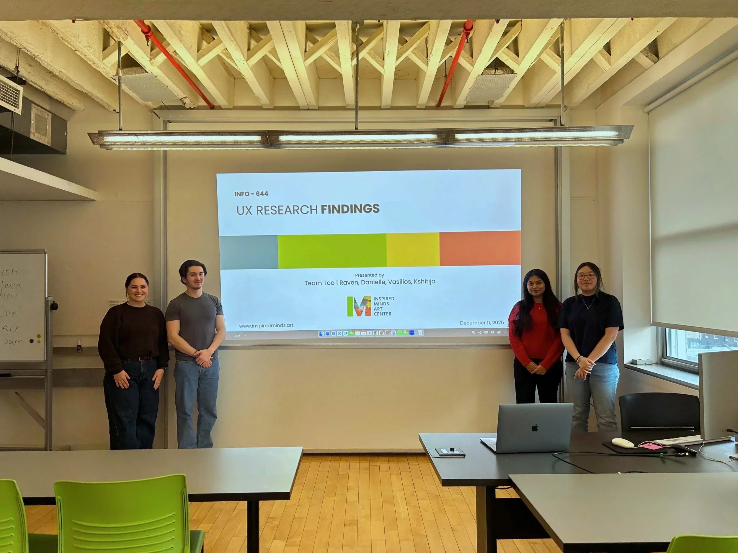
Finally, our team met with the client to present our findings with mock-ups to illustrate our final recommendations following testing and analysis. We were pleased when the client was impressed and appreciative of our proposals: that expressed that our findings validated some of their internal concerns about the website while uncovering tangible recommendations.
Reflections
Meet the client where they are.
Our client had less of a technical background, and that context really informed key elements of the project: how we structured user tests, how we thought about user experience, and how we positioned our recommendations.
Managing client expectations is key.
The client had lofty goals and, while we wished we could’ve helped with everything, we had to keep our project scope in mind and navigate things with clear and considerate communication.
If I could do one thing differently…
I would have worked with the client and team to build in one more checkpoint within the given timeline as a gut-check on the usability test tasks we created. Ultimately we were aligned on priorities, but given the client’s experience level, that would have been another good opportunity to set expectations.
INFO 643 Usability Theory & Practice
Professor Craig MacDonald
Pratt Institute School of Information | Spring 2025