
This project is in progress. Come back soon!
Interacting with Labor Data in Tableau
Uncovering potential patterns in historic labor data — what might it tell us about the current state of labor in the United States?
In the early-to-mid 20th century, labor unions played a critical role in supporting American workers by boosting wages, reducing income inequality, and improving working conditions across many different industries.
However, rapid industrialization and growth of economic competition in the United States in the decades to follow would seemingly render traditional unions outdated and ineffective, often evidenced by a steady decline in membership rates.
Project goal: Uncover potential patterns in historic labor data and see what they might add to the story of labor in the United States.
Union Membership is on the Decline, but Union Impact Isn’t
-
Following the Covid-19 Pandemic, labor unions appeared to be on the upswing. By 2023, Starbucks employees at more than 250 stores voted to unionize.
-
Workers at Trader Joe’s, REI, and Amazon warehouses across the country began major organizing efforts.
-
News headlines everywhere appeared to report on the seemingly resurgent movement, adding fuel to the fire of pandemic-weary workers across the country
After months under the radar, were labor movements finally having their moment?
Interested in exploring this potential paradox, I’ve been asking the question: what can patterns and microtrends in labor and economic data tell us about the status of labor unions in the U.S.?
A Four-Phase Approach
Phase 01 | Getting to Know You: an Introduction to Labor Union Activity 1983-2024
Identify and visualize broad patterns, relationships, and outliers among the dataset.
Phase 02 | Zooming In: Eye on the COVID-19 Pandemic
Investigate the data surrounding a specific historical event.
Phase 03 | Mapping Labor & the Economy in R
Understand how union activity fits into the larger economic environment by visualizing union data in tandem with other economic variables.
Phase 04 | Present, Discuss, & Refine
Present findings to a class of data analysis masters students and refine visualizations based on peer feedback.
Phase 01 | Getting to Know You: an Introduction to Labor Union Activity 1983-2024
-
Familiarize the viewer with key “players” in the realm of labor unions – historic state membership, member counts, and employment counts – without visually overwhelming them with decades’ worth of data.
-
All union membership and employment count data available from the Bureau of Labor Statistics from 1983-2024:
Union membership rates
Union member counts
Employment counts
-
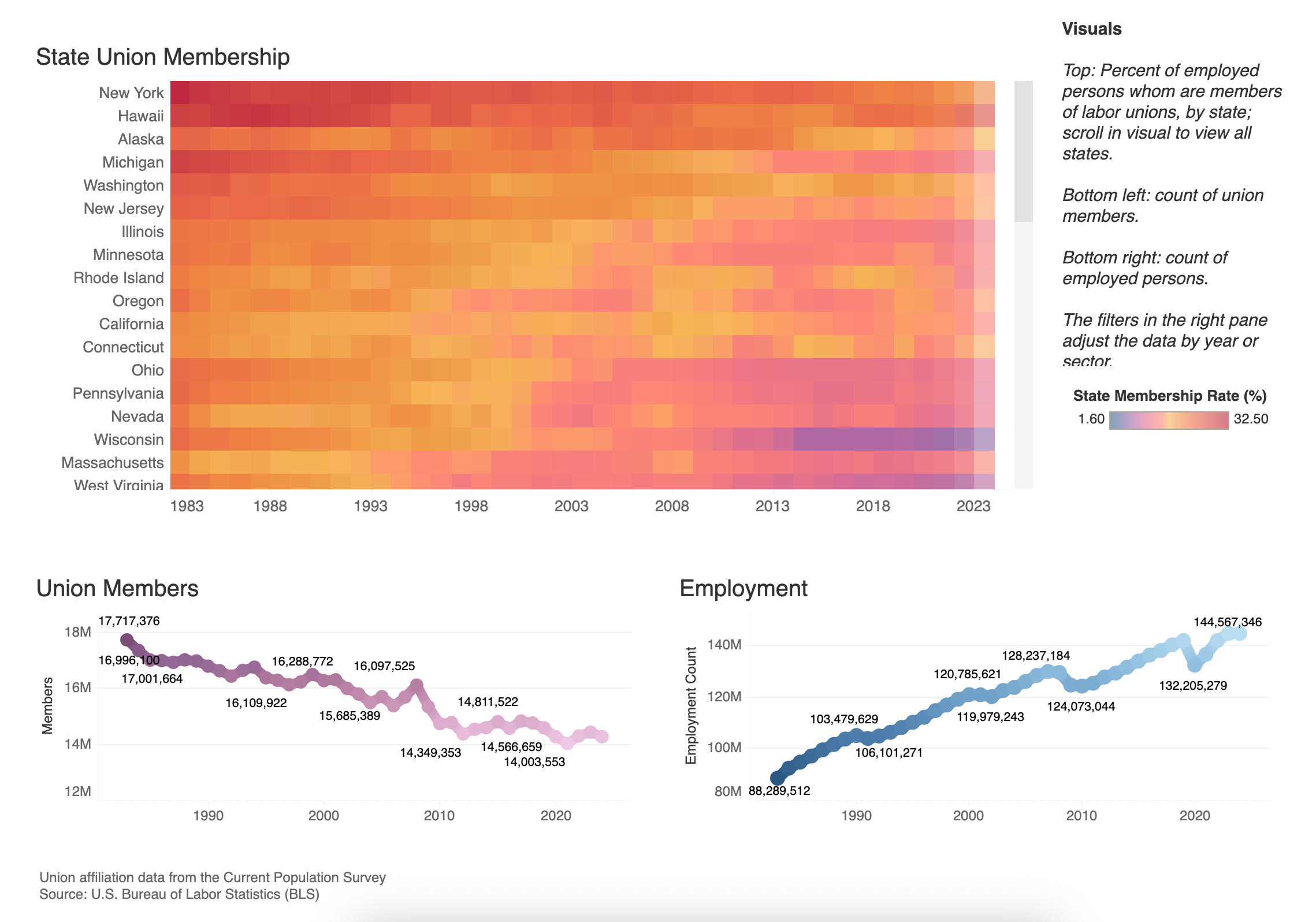
An interactive Tableau dashboard (figure 1) which includes the following visualizations:
Heatmap: union membership rates by state
Trend line/graph: annual count of union members
Trend line/graph: annual count of employed wage and salary workers
The Full Tableau Dashboard & Visual Breakdown
Figure 1: Above, view of Tableau dashboard. Scroll to view all graphs or click here to view the full visualization in Tableau.
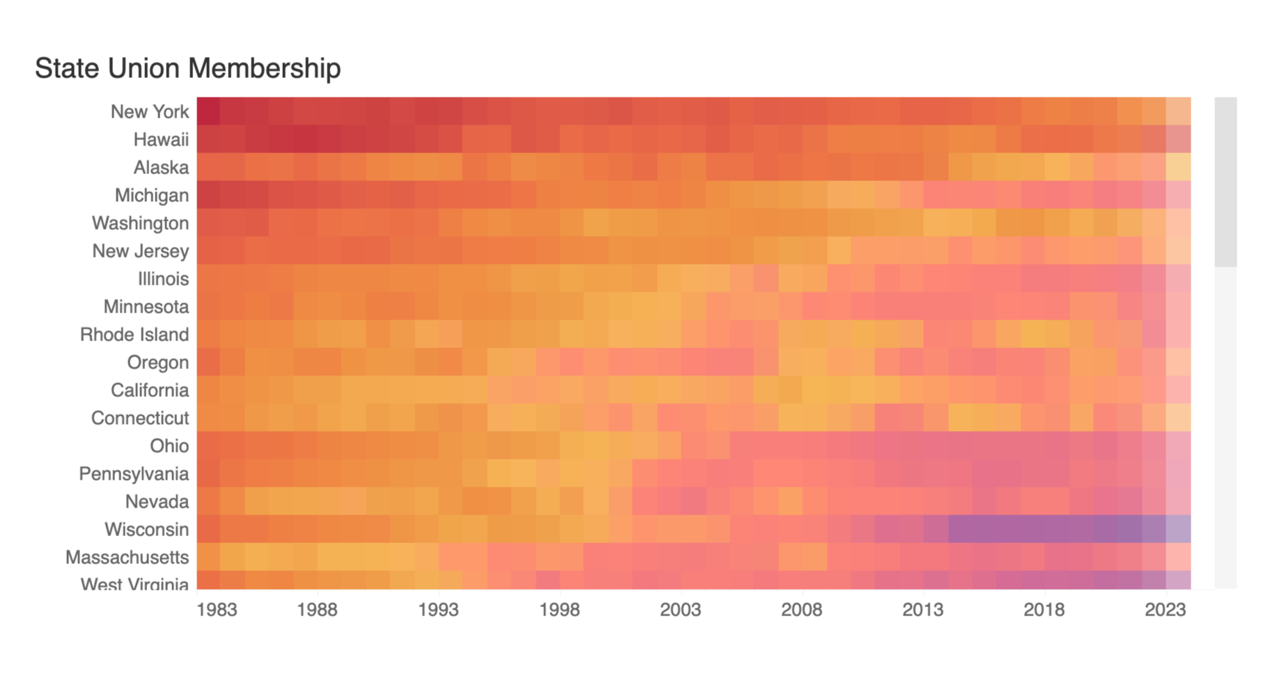
Figure 2: Each colored square represents the membership rate for a given state (y-axis) during a given year (x-axis). Red indicates higher membership rates, purple indicates lower membership rates. In the dashboard, the user can hover over and/or select individual states to see specific membership rates.
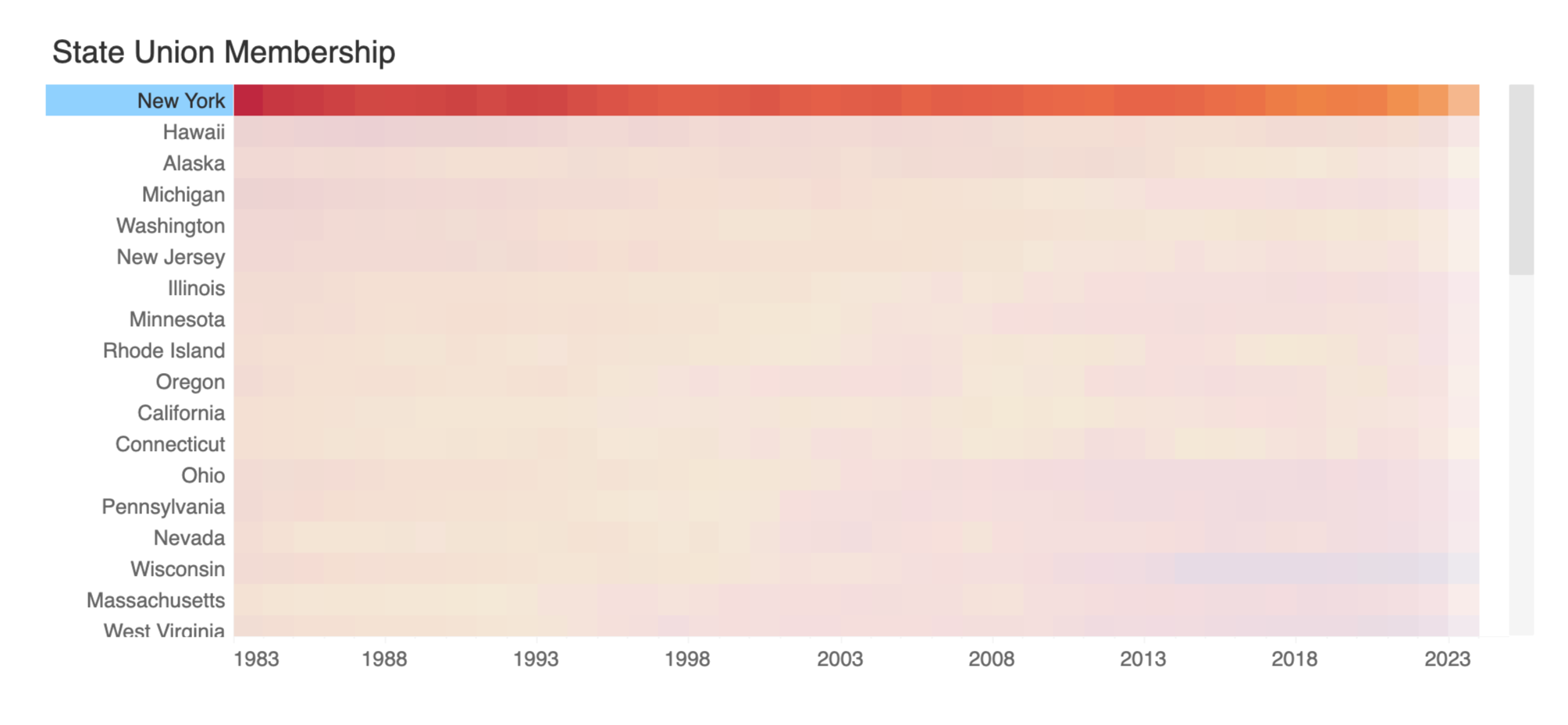
Figure 3: See New York highlighted – what do you notice? On average, New York State has maintained the highest average union membership rate since 1983. As of 2024, it hovers around 20 percent (nearly double the rate of the national average, 9.9 percent).
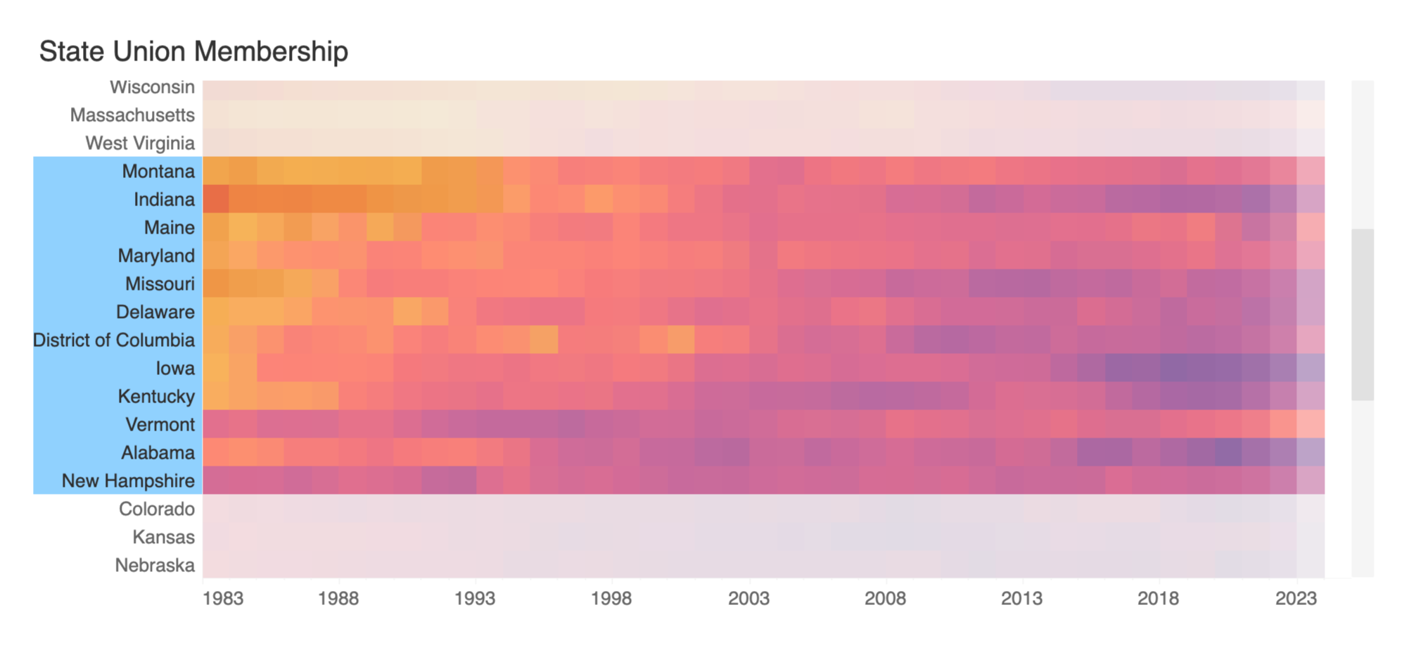
Figure 4: When you scroll to the middle of the table, you can see how much more the membership rate has fluctuated in some states than in others – Vermont, for example, had a relatively low membership rate until the late 2000’s and early 2010’s when it started to increase more consistently.
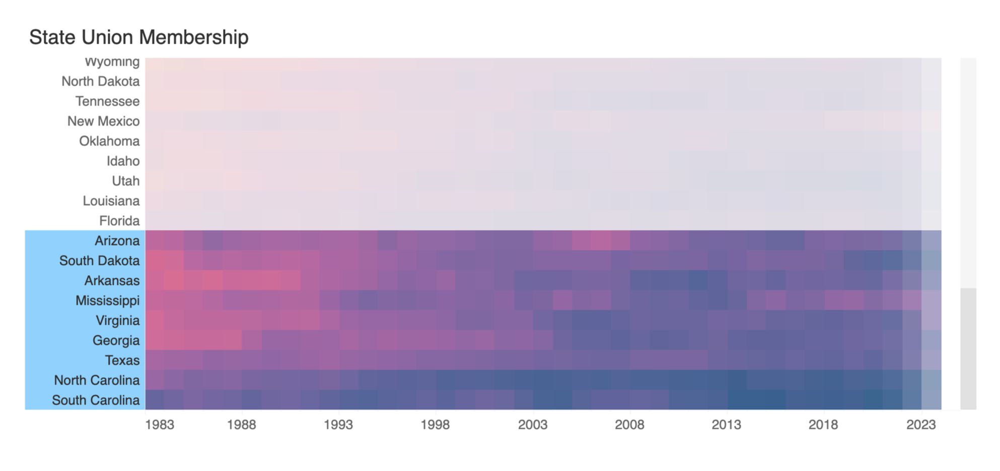
Figure 5: States with the lowest average membership rates from 1983-2024.
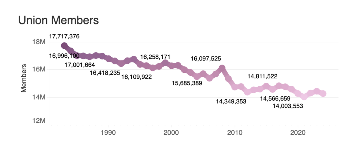
Figure 6: In this line graph, we can see that the number of employed persons who are members of unions has steadily decreased since 1983, with a few noticeable peaks in membership over the decades
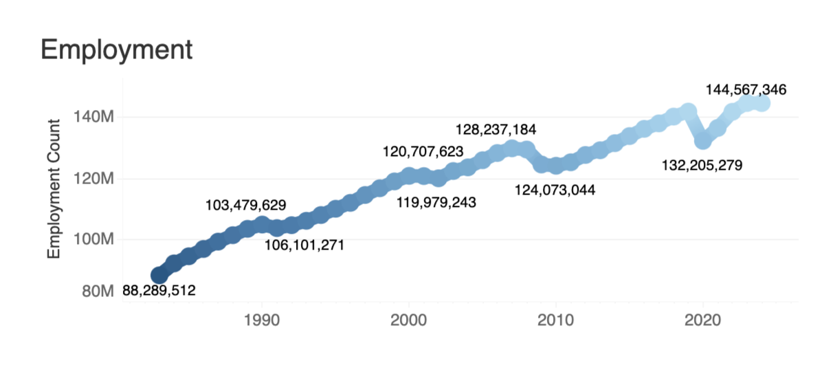
Figure 7: This line graph shows the number of employed persons – we see that number has increased steadily since 1983.
Phase 02 | Zooming In: Eye on the COVID-19 Pandemic
-
Visualize changes in union membership rate and employment between pre- and post-COVID-19 pandemic.
-
BLS union membership and employment count data from 2014-2024.
-
A Tableau Dashboard (Figure 8) including the following visualizations:
Line graph: union membership rate 2014-2024
Line graph: employment count 2014-2024
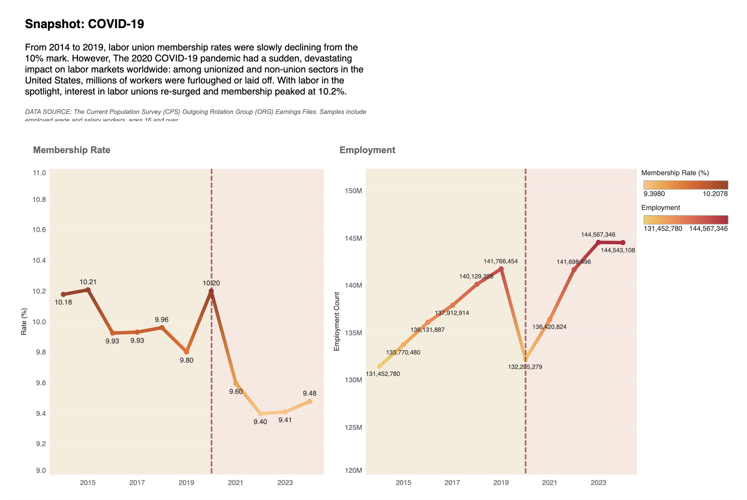
Figure 8: Screenshot of the Tableau dashboard. Click on image to view the dashboard in Tableau.
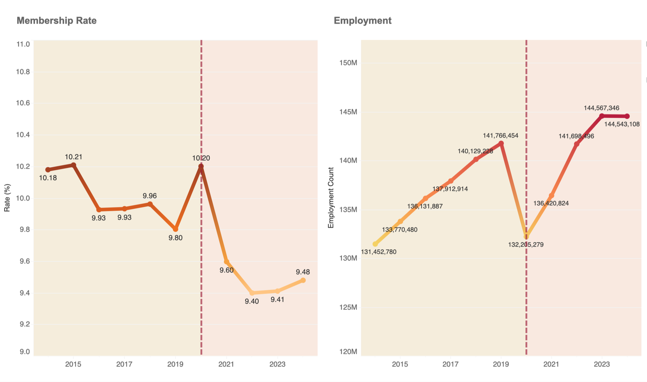
Figure 9: Observe the “before” and “after” period marked by the red dashed line: what do you notice about the way membership and employment are trending? It’s generally reflective of the larger historic trend we observed earlier: over time, union membership has decreased while employment has increased.
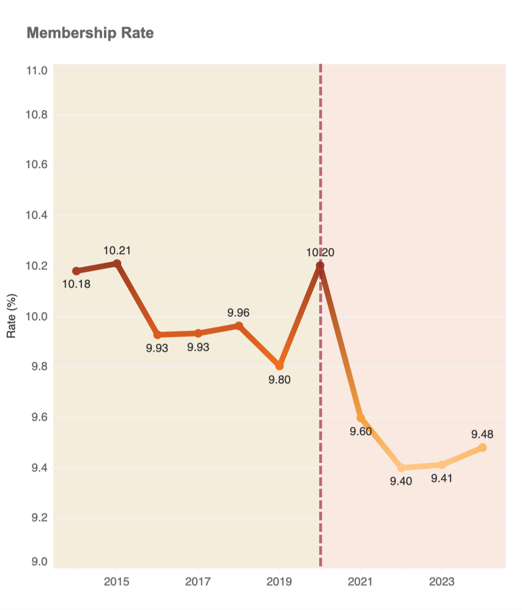
Figure 10: Look at the red dashed line at the year 2020: not only does it separate the “before” and “after” 2020, it’s also to call out the sudden spike in membership and drop in employment – a recent example of an event contrary to the overall trend in the data.
Phase 03 | Mapping Labor & the Economy in R
-
Examine U.S. population, union membership, and employee earnings together to understand how union activity fits into the wider economic environment.
-
BLS union membership rate and total employee average annual earnings, and U.S. population figures from the Census Bureau 2014-2024.
-
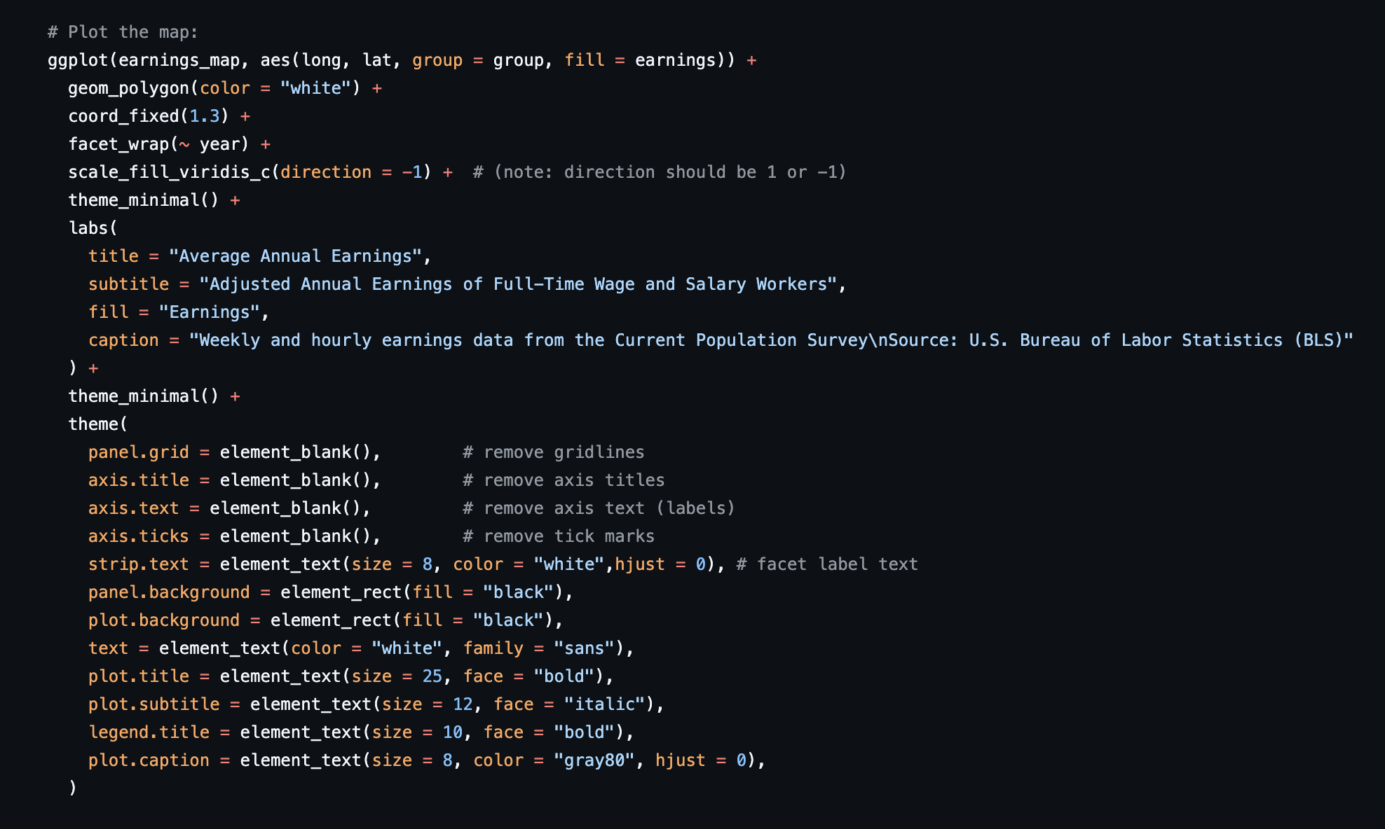
A series of maps created in R leveraging the following libraries:
tidyverse (collection of data science packages)
gcookbook (datasets for ggplot2 examples)
maps (collection of map data)
mapproj (required for changing projection on maps)
sf (spatial data handling and geometric operations)

Maps at a Glance: Earnings, Union Membership, & U.S. Population
Each set of maps visualizes different variables and units of measurement, so color is used to maintain a sense of consistency and better support the viewer’s comparison of them.
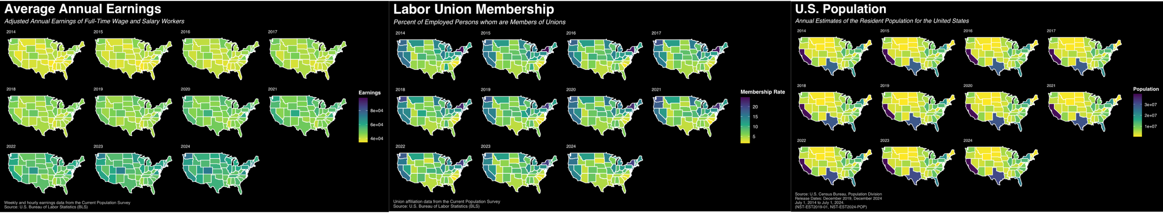
Figure 11: The idea here was to visualize union membership alongside other relevant data — U.S. population and worker earnings — in order to start building an understanding of how union activity fits into the wider economic environment.
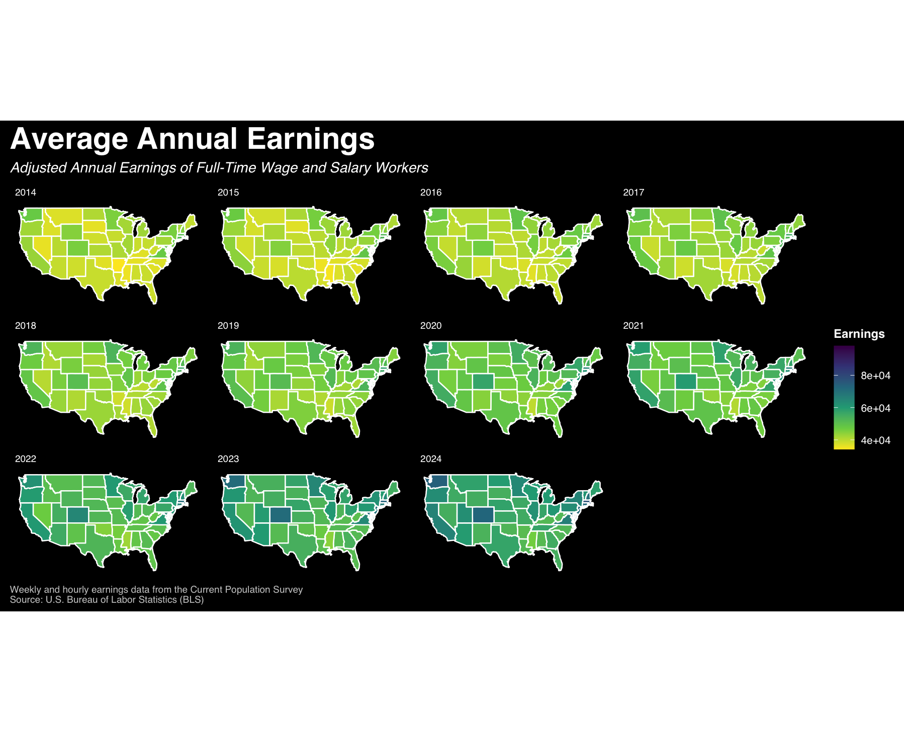
Figure 12: Average annual earnings of employed persons 2014-2024
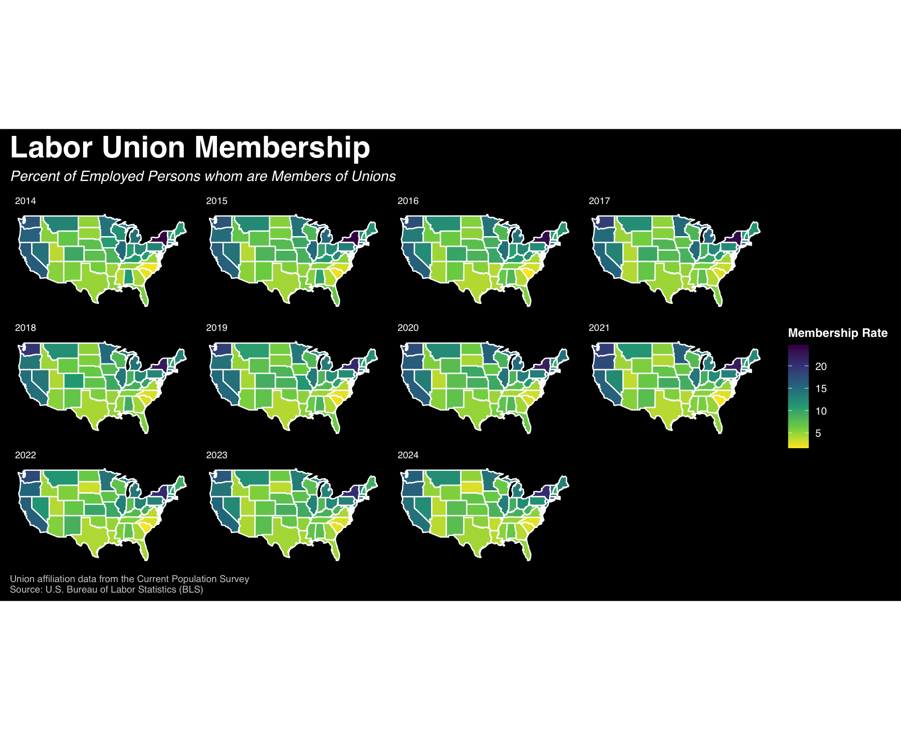
Figure 13: Labor union membership rate 2014-2024
Figure 14: U.S. population 2014-2024
Phase 04 | Presenting & Refining Visualizations
-
Refine visualizations based on the feedback from master’s students in the Data Analysis & Visualization program at Pratt Institute.