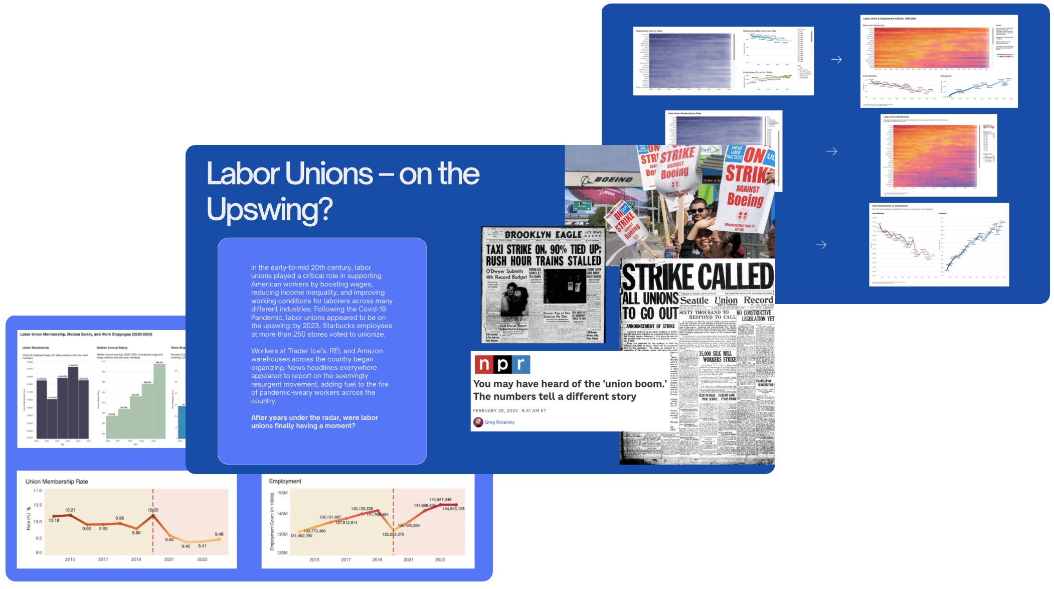
Visualizing Decades of Labor Data in Tableau Dashboards
Interested in understanding the evolution of labor unions in the US, I wondered if there was a better way to view and interact with historic labor and employment data.
Using Tableau, I built an interactive dashboard for users to get familiar with historic labor and employment data.
01 Challenge: Familiarize viewers without overwhelming them
Visualizing hundreds and hundreds of data points in such a way that it does not visually overwhelm the viewer would be my main challenge. Selecting visualization types and employing the right tools would be key to doing so.
02 Solution: Provide context, keep it simple, offer interaction, and keep things as consistent as possible
Using Tableau, I built an interactive dashboard visualizing historic labor and employment data. Using a separate, static dashboard, I captured specific snapshots of data to zoom in and illustrate the impact of micro trends to the user. Lastly, leveraging R’s geographic libraries, I mapped out key labor and economic variables to offer further perspective around the topic.
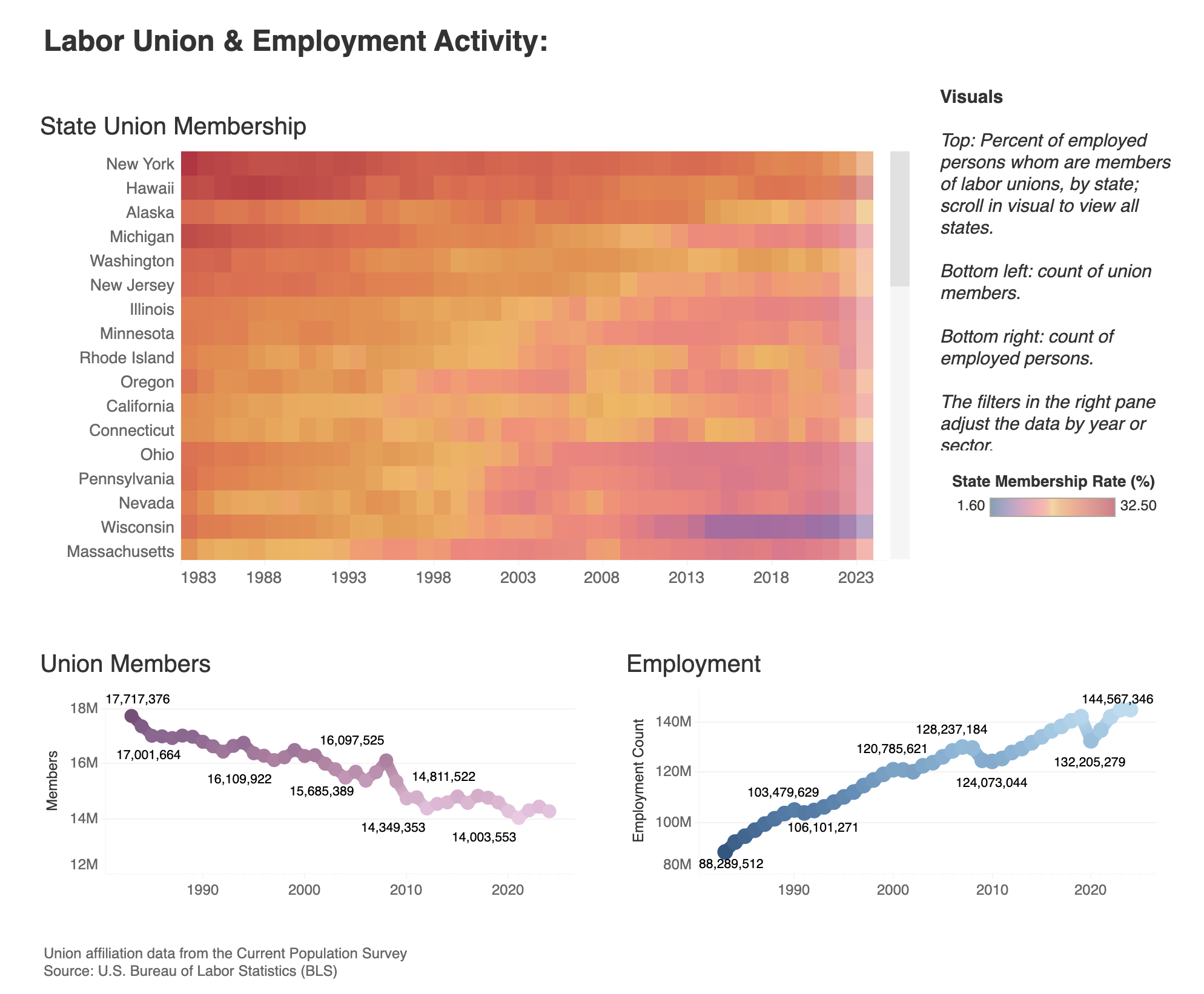
Above, Left: Historic Labor & Employment Data. Users can select a particular state or states on the heatmap to viewer specific membership rates and observe visual trends in the changes over time. Tableau dashboard linked here.
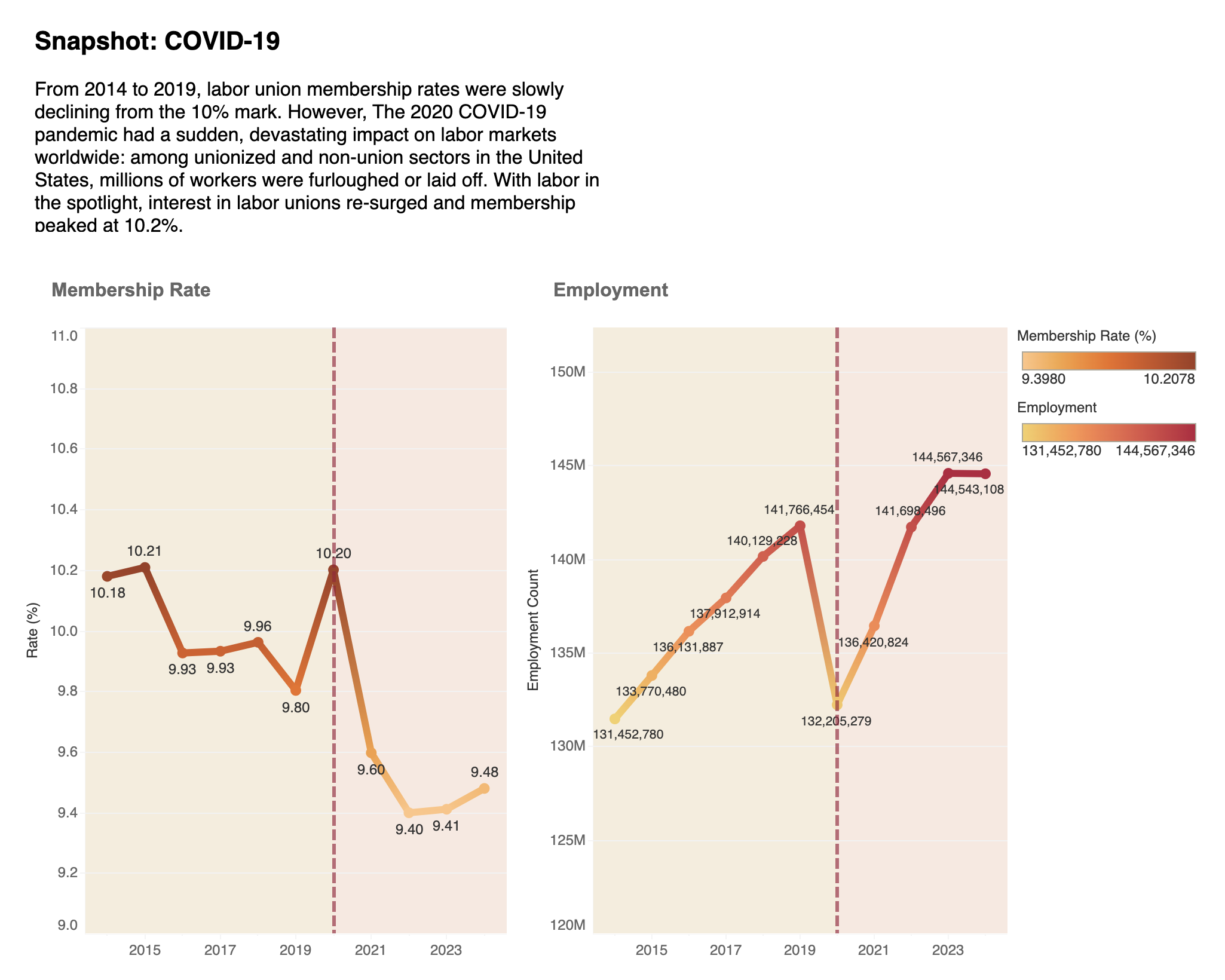
Above, Right: Snapshot, Before & After COVID-19. In contrast to the steady decline in union membership and steady climb in employment rate we see in the previous dash, a static view of the years before and after COVID-19 began shows a more volatile run of membership and employment. Tableau dashboard linked here.
03 Process: An iterative approach
Working with such a large amount of data, I knew organization and iteration would be key:
Start broad: explore union-specific data to understand historical patterns, relationships, and outliers within the dataset.
Employ best practices: leverage common visualization techniques that best communicate general historic trends.
Zoom in: dive deeper into sector data to uncover potential micro trends among labor union membership and employment.
Afterwards, peer review and user testing revealed key insights to inform dashboard revisions:
Heat map color scheme & key: user feedback indicated that color choice was impacting the viewer’s ability to interact with and understand the visual.
Line graphs: user feedback also suggested that it was less clear how viewers were supposed to interpret the line graphs when they appeared stacked vs. side-by-side.
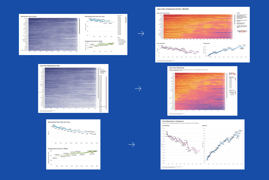
Before & After Left: original Tableau visualizations; right: updated Tableau visualizations
04 Reflections
Exploratory analysis is essential: before I even thought about opening Tableau or R, I had to consider what my data needed to look like in order to create the type of visualizations I envisioned. Understanding the data structure and cleaning the data was a foundational step in the process.
Conduct user testing whenever possible: everyone is going to interpret visualizations in a different way, so incorporating feedback from perspectives other than my own helped me revise and ultimately improve initial versions of my visualizations.
Data-driven vs. story-driven: approaching a project like this where this is a lot of existing narrative surrounding the topic was difficult. I had to maintain perspective and let the data tell the story, and not the other way around.
Library Imports & Documentation
INFO 658 Information Visualization
Professor John Lauermann
Pratt Institute School of Information | Spring 2025