Mapping US Electricity Price Volatility 2020-2025
Note: this project is currently ongoing. I’m tracking progress on this page, so stay tuned for updates.
As part of a wider effort to understand the energy costs of data centers, I’m exploring residential electricity costs in the United States from 2020-2025. While companies like Microsoft and Amazon have made claims that energy prices won’t rise near data centers, other groups have published research stating otherwise. Who’s right, Big Tech, or other research and advocacy groups?
01 Challenge: Determine whether data center locations are associated with higher residential energy costs.
The short answer? Potential impact of data center on residents when it comes to energy prices is a complex issue. Data on data centers is precarious, especially considering the US’ fragmented energy infrastructure.
02 Solution: Focus on recent price trends
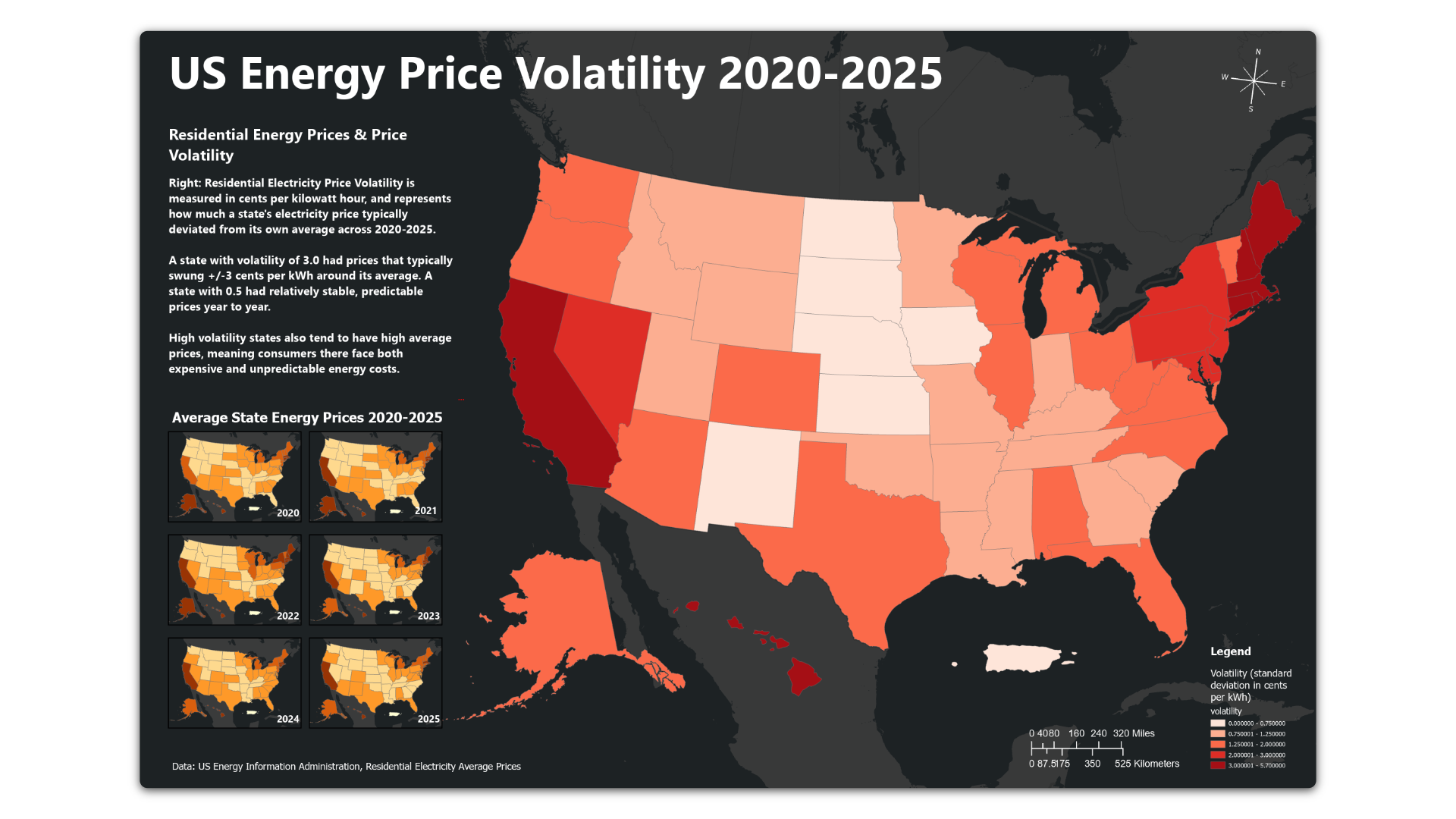
I focused on recent trends: electricity price volatility and average prices by state (below).
03 Process: Accessing APIs, geocoding data, then mapping data in ArcGIS
Accessing APIs
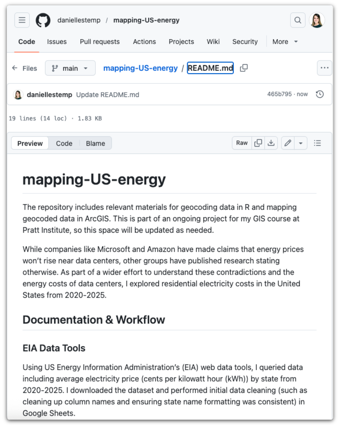
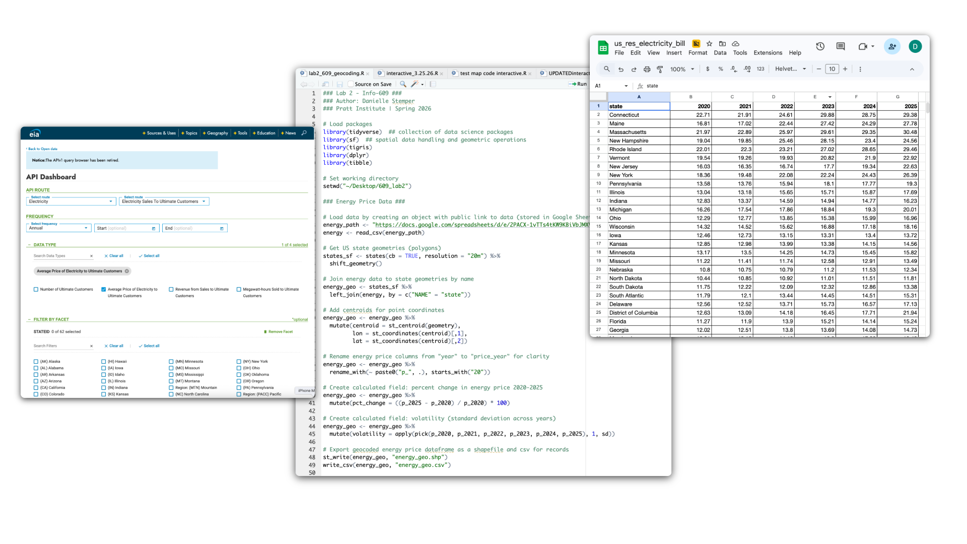
Using EIA’s web data tools, I queried data including average electricity price (cents per kilowatt hour (kWh)) by state from 2020-2025. I downloaded the dataset and performed initial data cleaning (such as cleaning up column names and ensuring state name formatting was consistent) in Google Sheets.
Geocoding data & determining price volatility
Next, I loaded the dataset into R to geocode it using libraries including tidyverse, sf, and tigris. Because the dataset gave me average price by state per year, I created a computed column that calculated price volatility, that is, the standard deviation of the average energy price for each state — the volatility values are in cents per kWh and represent how much a state’s electricity price typically deviated from its own average across 2020-2025. I decided to visualize this to add a layer of depth to simple average price data, offering further context around rising prices.
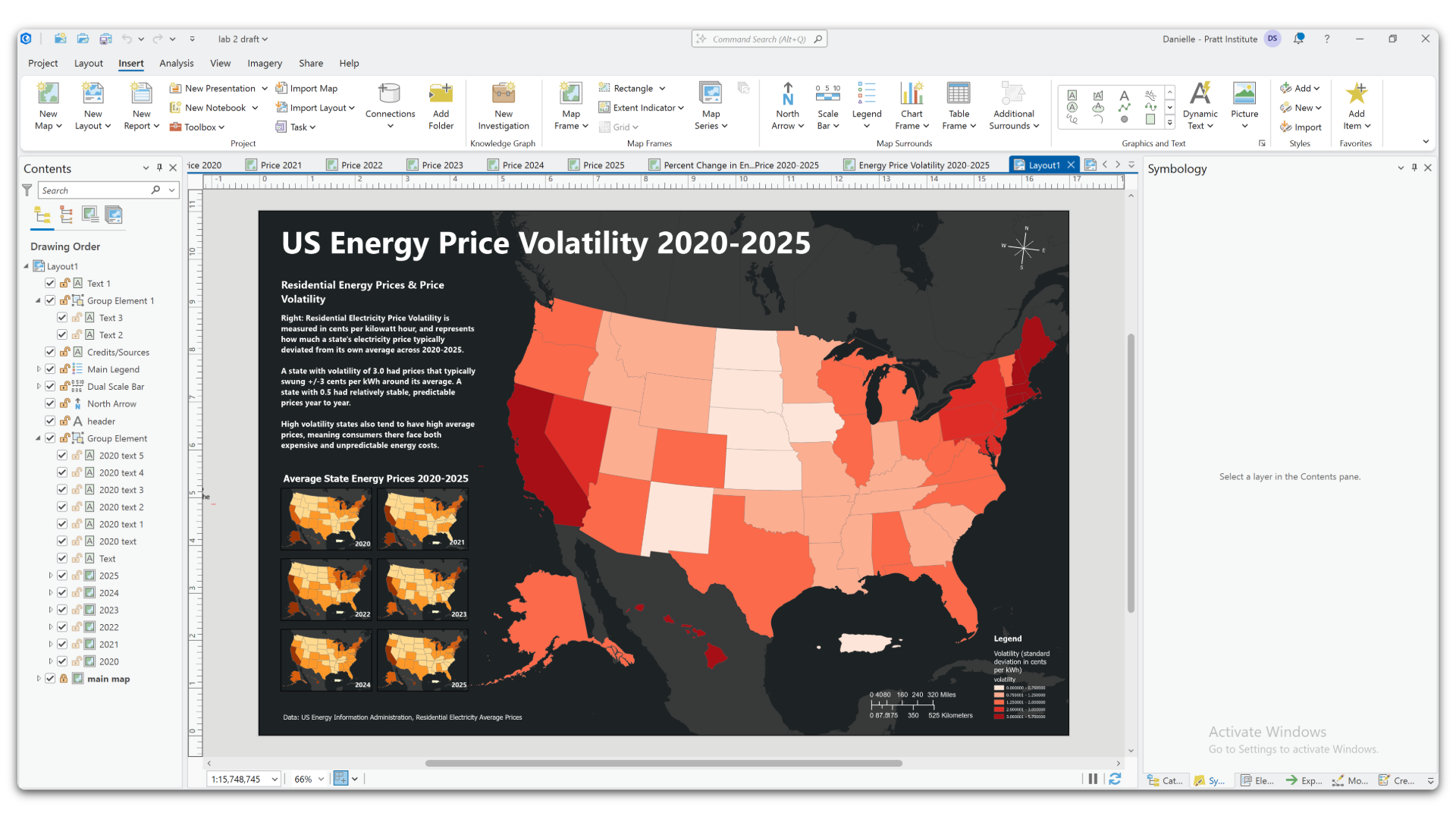
Mapping in ArcGIS
With my newly geocoded dataset, I created individual maps of average electricity price by state for each year 2020-2025. Then, I created a separate map for electricity price volatility. The final visual consists of price volatility as the main map, and average price maps for each year as an inset.
Color
Color is used to visualize the price variations across the US.
Price Volatility: The price volatility map uses a red color scheme – lighter shades of red represent lower volatility, darker shades represent higher volatility.
Average Price: Average price maps use a yellow to brown color scheme. Lighter shades represent lower prices, darker shades represent higher prices.
Base Map: The map color schemes are visually contrasted with a dark grey base map.
Text: All map text is white to stand out from the dark background.
04 Reflections & key findings
Limitations
Energy infrastructure in the US is largely fragmented, and the data used relies on the assumption that individual energy providers are consistently sharing accurate, timely information with the EIA.
Average prices increased year-over-year
All states in the data showed positive values, meaning every state’s electricity got more expensive from 2020-2025. Washington DC (73.7%) had the largest price surge as prices nearly doubled in 6 years. Iowa (10.1%) saw the smallest price increase. The national average increase was ~29%.
Price volatility varied by region
Hawaii (5.5) and California (5.0) had the most volatile prices. Iowa (0.46) and North Dakota (0.49) had the most stable prices. Northeastern states tend to be more volatile in electricity pricing that midwestern and southern states. Interestingly, high volatility states like California, Hawaii, and Maine also tended to have the highest average prices — consumers there face both relatively more expensive and unpredictable energy costs.
Framework for future work
Overall, this sets the stage for further analysis of other variables, such as income level from US Census data, in comparison to electricity prices trends. Facing significant energy burdens, Black households, Hispanic households, low-income residents, and renters “spend up to 20% of their income on energy, compared to 3% for higher-income households” (Yañez-Barnuevo, 2026).
Library imports, summary of function sections, and documentation
INFO 609 GIS
Professor John Lauermann
Pratt Institute School of Information | Spring 2026