Visualizing Labor & Economic Trends with R and Tableau
Overview
In the early-to-mid 20th century, labor unions played a critical role in supporting American workers by boosting wages, reducing income inequality, and improving working conditions for laborers across many different industries.
Following the Covid-19 Pandemic, labor unions appeared to be on the upswing: by 2023, Starbucks employees at more than 250 stores voted to unionize. Workers at Trader Joe’s, REI, and Amazon warehouses across the country began organizing.
News headlines everywhere appeared to report on the seemingly resurgent movement, adding fuel to the fire of pandemic-weary workers across the country.
After years under the radar, were labor unions finally having a moment?
Interested in exploring this potential paradox, I’ve been asking the question: what can microtrends and patterns in labor and economic data tell us about the status of labor unions in the U.S.?
01
Approach & Methods
02
High-level Trends
03
Snapshot: Covid-19
04
Labor & Economy Maps
05
Reflection
01 Approach & Methods
Software
R
Tableau
Excel/Google Sheets
Data Sources
Bureau of Labor Statistics (BLS)
U.S. Census Bureau
Methods & Process: an Iterative Approach
Explore union-specific data to understand broad patterns, relationships, and outliers within dataset
Leverage common visualization techniques that best communicate general historic trends
Dive deeper into different sector data to uncover potential micro-trends among labor union membership
Contextualize membership data with additional labor and economic variables
02 High-level Trends
Getting to Know Unions
My goal with the visuals below was to familiarize the viewer with key “players” in the realm of labor unions — including historic state union member rate employment counts — without visually overwhelming them with decades’ worth of data.
Initial Methods & Choices
Selected a varied but consistent color palette to distance viewer from the reds and blues often used in political data visualizations.
Created heat map to introduce a geographic variable – states play a historic role in union activity, but ’s not essential for viewers to get granular at this point.
Leveraged count data to keep whole numbers loosely in perspective.
Revisions
Based on peer review feedback and user testing sessions, I made the following updates to my visuals:
Heat map color scheme & key: user feedback indicated that color choice was impacting the viewer’s ability to interact with and understand the visual.
Line graphs: user feedback also suggested that it was less clear how viewers were supposed to interpret the line graphs when they appeared stacked vs. side-by-side.
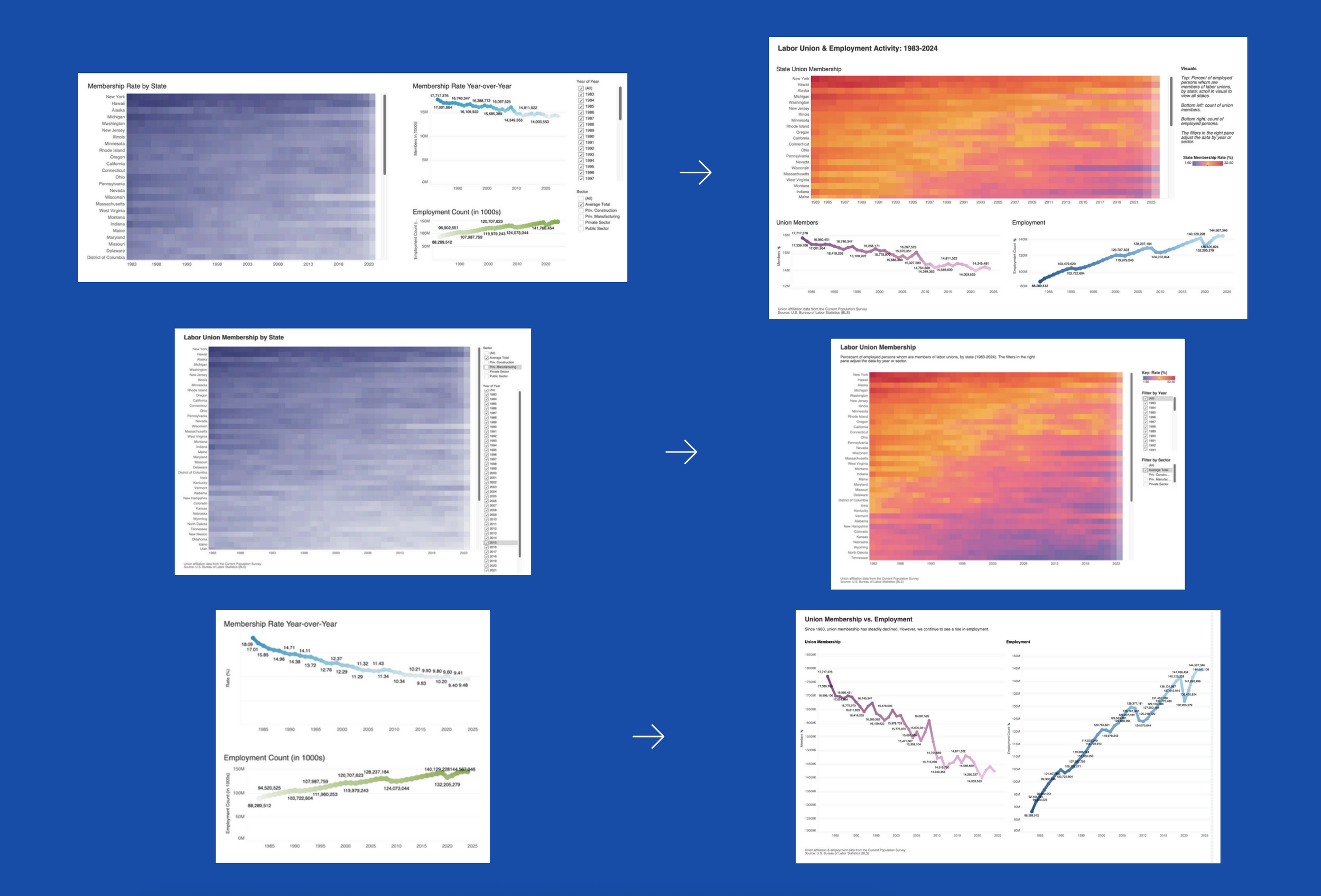
Left: Original Tableau visualizations; right: updated Tableau visualizations.
04 Snapshot: 2014-2024
Visualizing Recent Union & Employment Activity
Following a macro-introduction to labor data, I wanted to zoom in a more recent time period of union-related information.
A static view of these topics captures this vast amount of information at a more micro-level, offering a closer look at what’s happening with the numbers.
Methods & Choices
Top: histogram & line graphs:
The Histograms & line graphs to show two different views of membership, member earnings, and work stoppage data. The histograms offer a closer look at the numbers, while the line graphs show change in these variables over time.
Colors are kept more neutral, as no variable is meant to stick out more than another.
Two different visual methods of showing the same data is meant to offer contrast in how the data can be viewed.
Bottom line graphs:
The Line graphs showing changes in membership rate and employment pre- and post-2020. Despite showing different variables, colors and visual elements are kept consistent to reinforce with the viewer that they are looking at data from the same time period.
The vertical dash line notes the year 2020, signaling to the viewer that “before and after” plays a role in the story the data is telling.
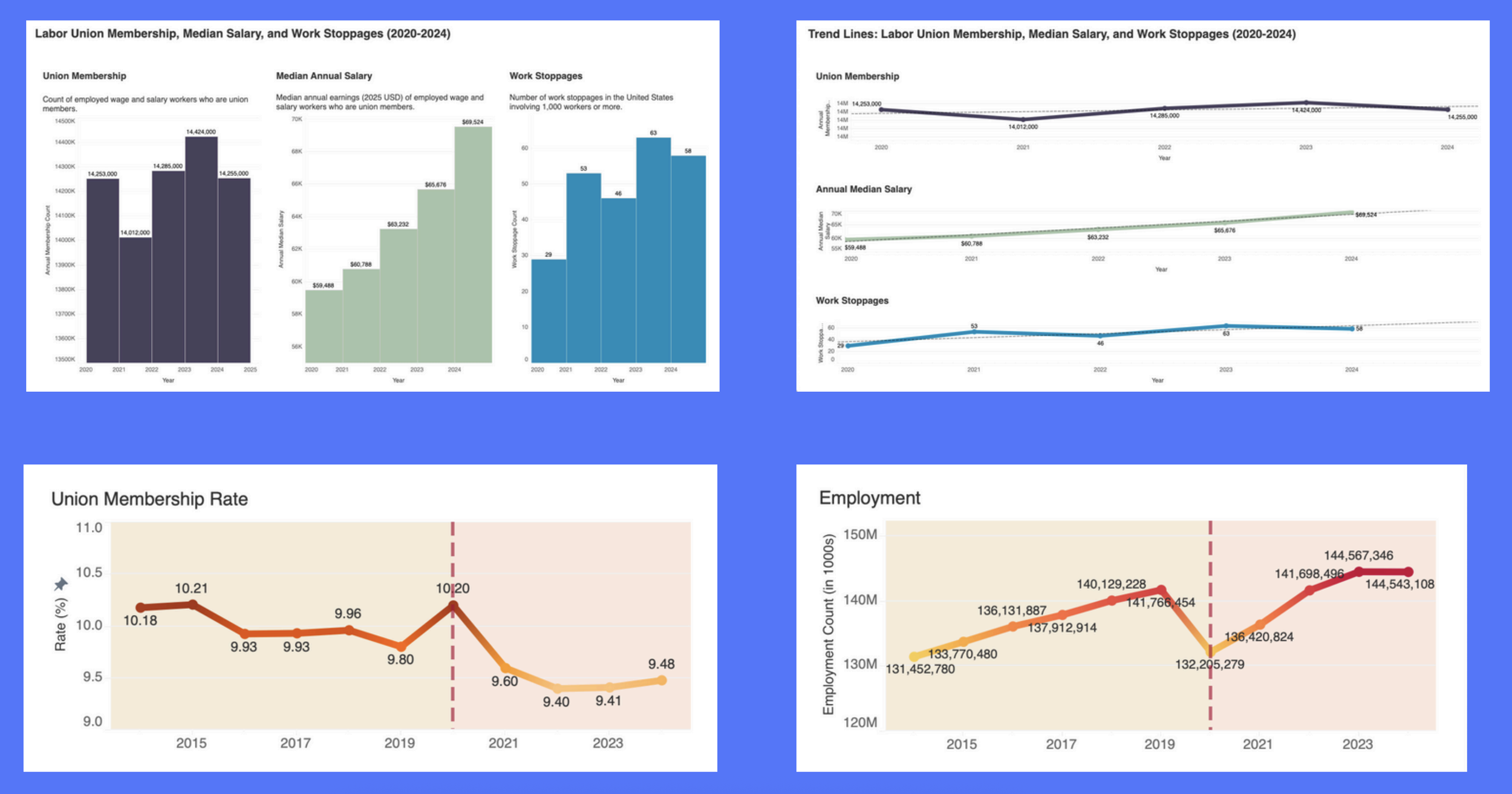
Top: Labor union membership, median annual salary, and work stoppages; bottom: labor union membership rate and employment, pre- and post-Covid-19
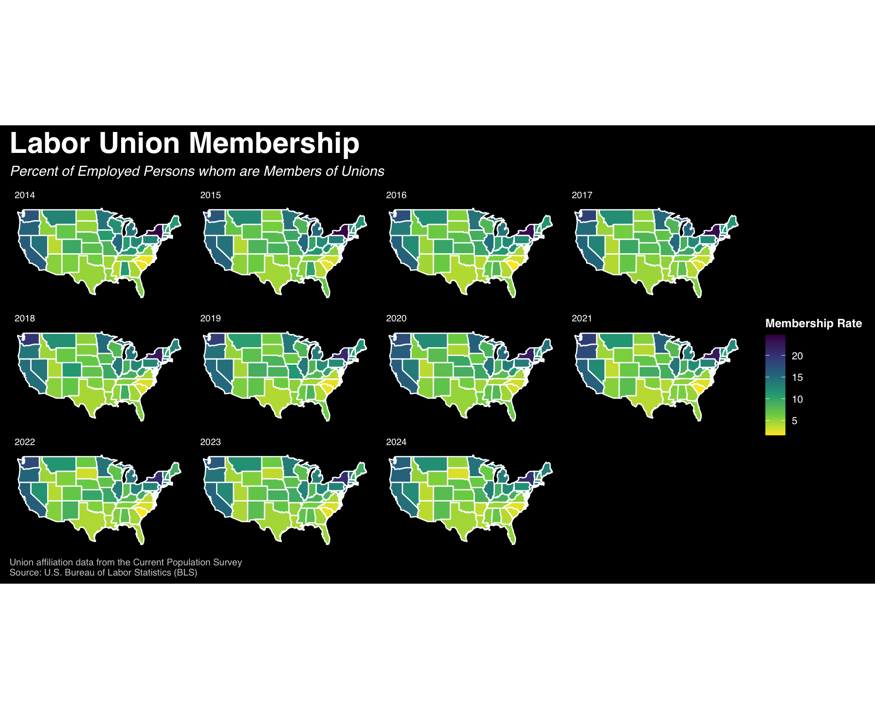
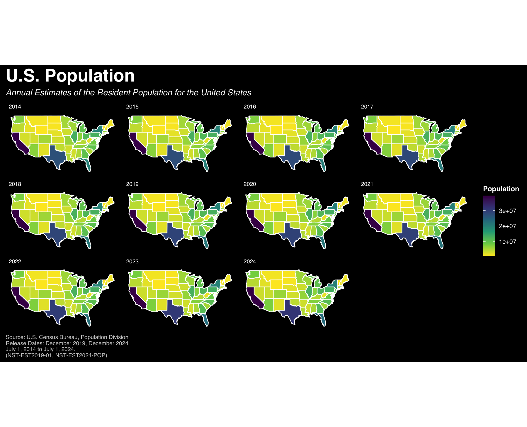
05 Labor & Economy Maps
Where do unions stand?
GDP, employment rate, inflation — variables we generally associate as traditional economic indicators. But labor union membership? Not typically used as a major economic indicator, but that doesn’t mean it doesn’t have a role to play.
The more we can normalize visualizing union-related activity alongside traditional economic indicators, the more nuance we can bring to these conversations.
Methods & Choices
Using R libraries including ggplot2, tidyverse, and maps, I visualized labor union membership alongside U.S. population and employee earnings by state from 2014-2024.
Each set of maps visualizes different variables and units of measurement, so color is used to maintain consistency.
Map sets are situated side-by-side to help the viewer absorb information from left to right.
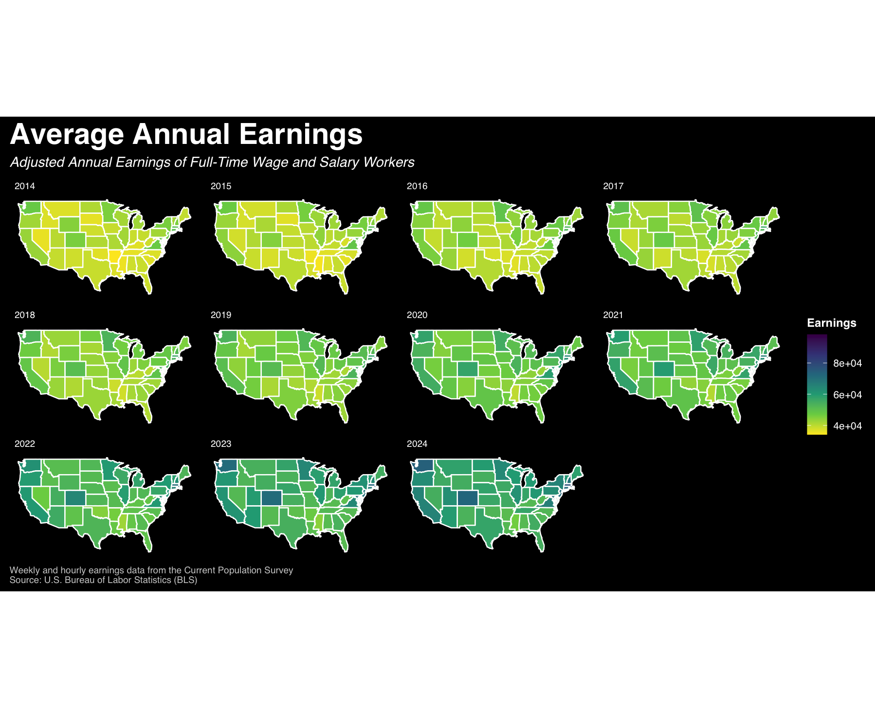
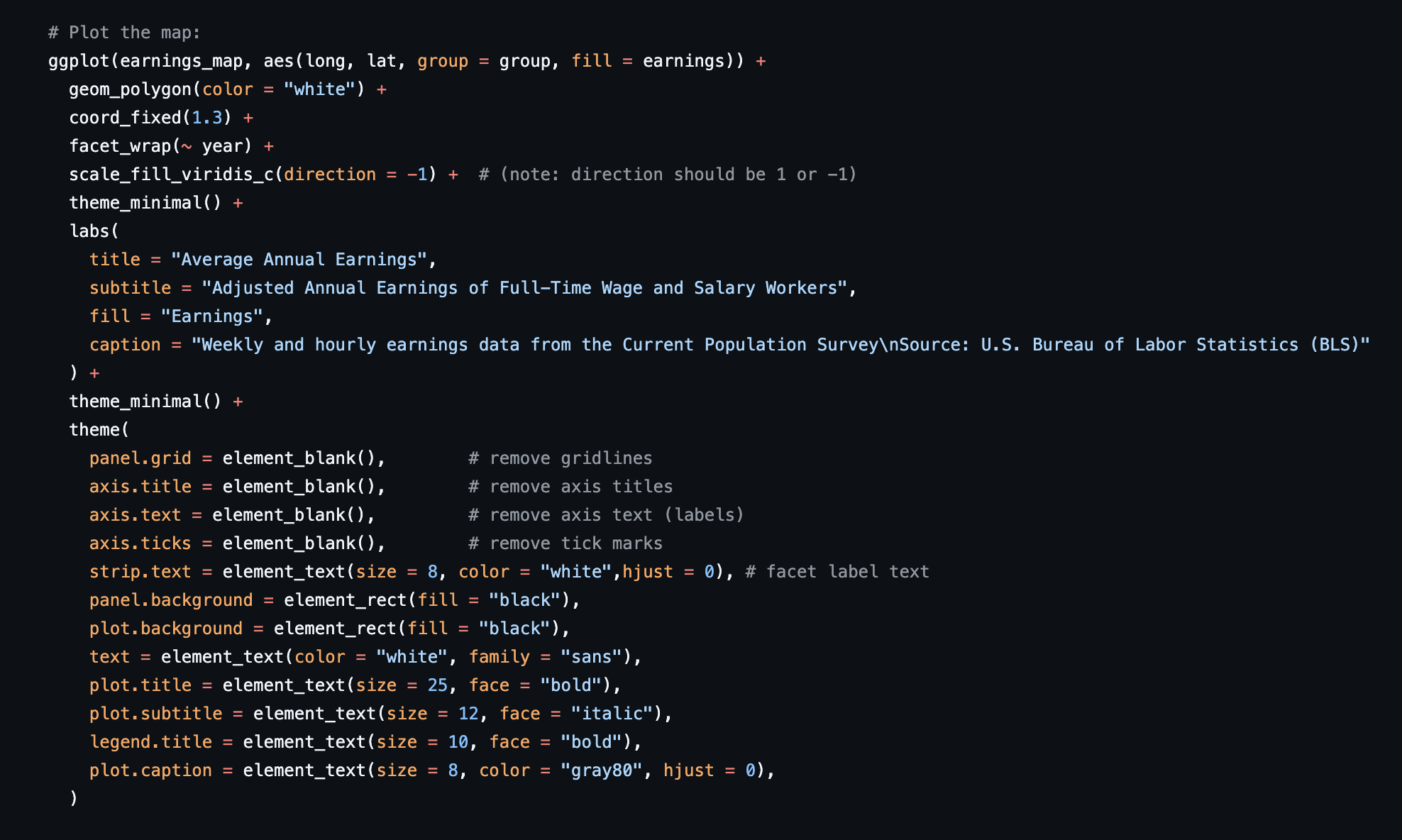
View the full R code in GitHub here.
06 Reflections
Membership rate in the U.S. has been on the decline for years, unaffected by the highs and lows of public approval – according to a 2024 Gallup poll, Americans’ approval of labor unions has actually been on the rise for the past decade. Despite the decline in membership, labor unions still have a role in today’s world of work.
It’s likely that the U.S. needs major policy changes which is something I’d like to explore further, using this visual work as a foundation. It’s also evident that broader economic and structural forces have shaped the status of unions, but historical analysis doesn’t guarantee future trends — particularly with the push by Big Tech companies, employers, and even governments for workers to “up-skill” or “re-skill” when it comes to learning about AI tools.